-
Oct 15 2018 Make your Instagram, Grid-friendly
Social media today, is dynamic. Trends are changing rapidly to grab the maximum attention. From worded content, to picture content and videos, digital-info consumption is evolving continuously. Instagram is about pictures & videos and we all keep looking for new ways of attracting potential digital traffic to your account and have them press that ‘follow’ button. The latest trendsetter with Instagram is the ‘grid’.
Grids are nothing but a set pattern which helps page owners attain the look that they have envisioned for their brand/page and eventually helps attract the digital traffic that your brand page is aiming for. Also, it’s always easier to work in a routine and Instagram grids are here to do just that. Specially if we are aiming to be the gen-next influencers that want the Instagram page to attract not just viewership, but also economic gains and business prospects.
3 CREATIVE (AND EASY) HACKS TO MAKE A GRID
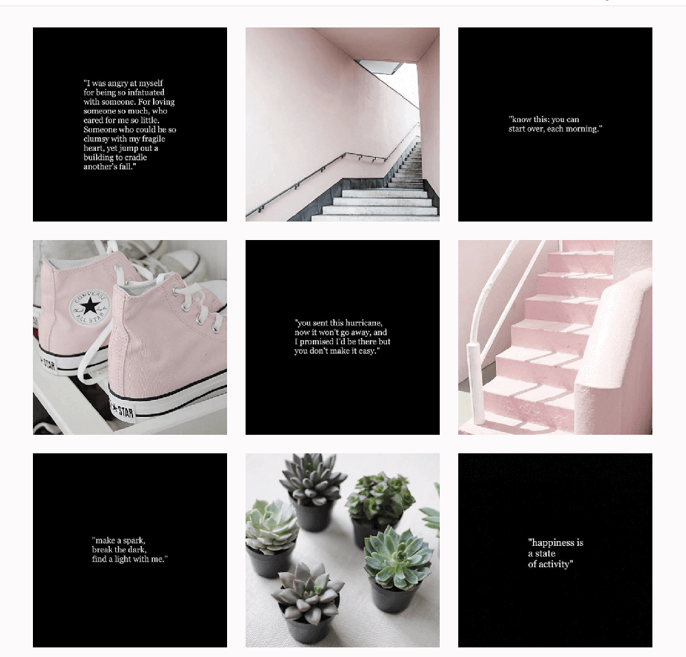
1. CHECKERBOARD
Content that is ‘tile’ style. Make a visually appealing theme, alternating your posts between either two theme colours or alternating between a minimalistic slide and busier slide. Think of a pattern that resonates with your brand theme, showcases your CTA (call-to-action) and convinces a viewer to respond immediately. Not very difficult to maintain, just remember to alternate your posts correctly and the grid will maintain itself

via schedugr.am2. HORIZONTAL LINES
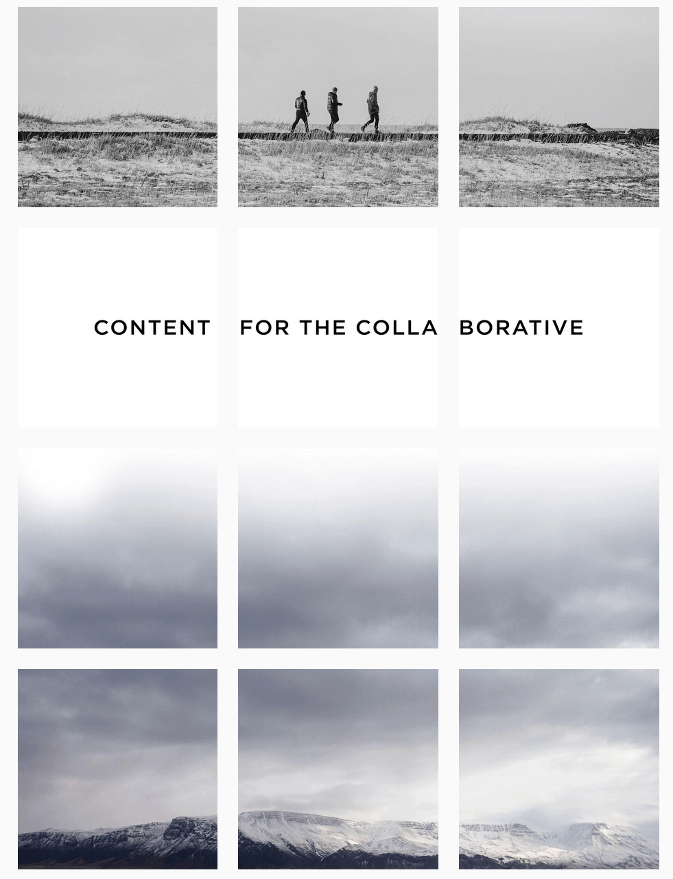
Do you want your Instagram page to tell a story, appealing to the people who are scrolling through your page? Travel, restaurant and pages that put up elaborate and picturesque posts, turn towards this style of planning their Instagram posts. It requires careful editing techniques to make a picture into 3 or 6 parts, maintain continuity in all pictures but also has a maximum impact on a viewer about to scroll down through your account
3. VERTICAL LINES
Only if you are prepared to be very very VERY committed to maintaining a grid, look no further. This grid simply requires you to maintain 3 equally attractive rows of content. Your visitors are now hooked on to the creativity (with discipline) exhibited and will keep scrolling down to look further into your brand and the variety of information you offer

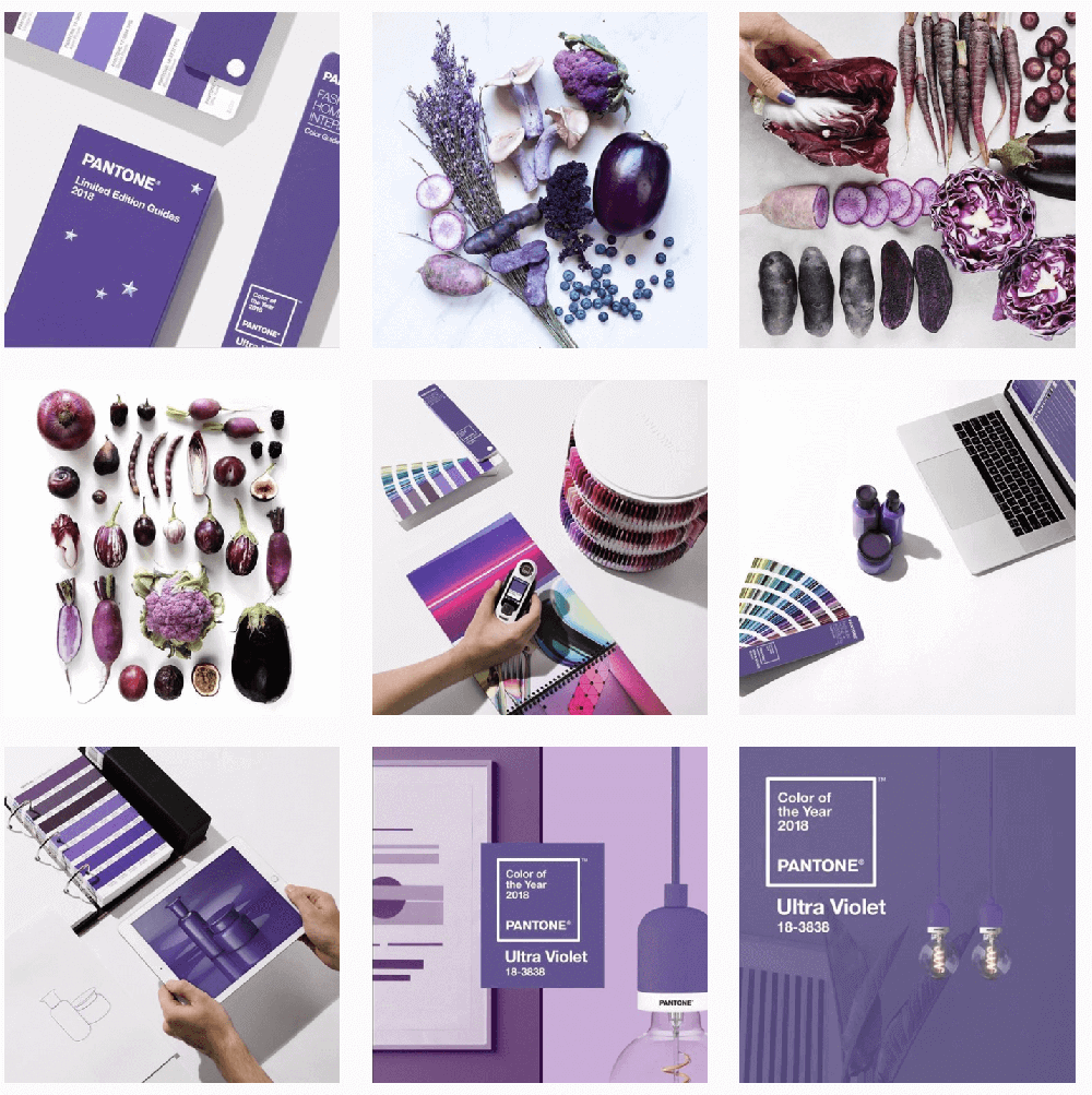
via refinery29.comOther than the above, themes can also be maintained with a singular colour background or a single colour border. Something as simple as a plain white border can also help sustain a theme or grid.
Instagram grids give your visitors, instant gratification. A few scrolls and they get the gist of what your page is all about, your highlights and takeaways. Well-maintained grids in Instagram pages give that extra nudge to your visitors to not just ‘double-click’ a few pictures here and there but also add your account to their must-see list.
So choose your grid and start planning now!


