
Your brand’s logo is directly linked to your business’ identity – it’s the first visual impression you offer consumers, stakeholders, journalists and more. Logos can evoke powerful emotions, and, when designed right, they can communicate a brand’s true essence. Besides starting out by understanding your target audience’s preferences, how do you really pack so much into one small image? Well, here are seven elements of a great brand logo –
1. Timeless

Trends change with every passing minute. Opt for a logo that is timeless so it doesn’t become obsolete after a few months or years because rebranding is an expensive and time-consuming process. Your logo should have a long shelf-life that’s classy. Dior, Coca-Cola, Jaguar, Target, Apple, Taco Bell, Adidas, Nike, 7-11, Puma, Swarovski and Starbucks are great examples of such logos that have stood the test of time.
2. Simple

Less is more, always. Don’t confuse your audience with too many elements in one tiny logo. In fact, even if you try to go overboard, the truth is half the detailing won’t even be visible on a tiny phone screen. Marie Kondo your logo design. It’ll be more memorable.
3. Adaptable
 As your brand scales up and your marketing campaigns spread across multiple channels, you’ll need a logo that can be adapted to your Website, brochures, t-shirts, billboards, social media infographics, video clips, business cards, pens, backdrops, standees and more. Your logo should look nice even if it is super large or super small, and should look decent in black-and-white color schemes as well as full color. Select colors and fonts accordingly.
4. Unique

Your logo should be distinct – the last thing you’ll want is for consumers to mix up your logo with another brand’s logo that looks very similar. Do enough research to avoid this blunder!
5. Typography & Colors
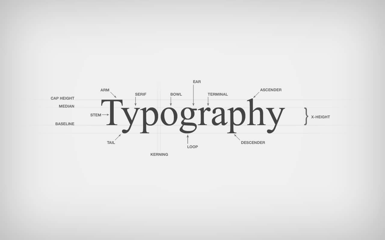
Typography and colors emit a lot of personality and carry certain connotations. Are you looking for font and colors that convey power or nostalgia or fun or feminine appeal or youthfulness? Are the font sizes you’re selecting going to be visible in a small size or from a distance? Are the colors aesthetic? Do they communicate the right values? Will they look good on different color background? Usually, experts recommend avoiding more than 3 colors in one logo. Also, more than 3 colors in a logo will increase production cost when printing. Follow this sound advice!
6. Meaningful
Your brand’s logo should be linked to your brand – there should be an interconnected meaning, rather than a sense of disjointedness. Your logo represents your brand’s vision, so make sure they are in sync. Think of tag lines that you want to include with your logo, as well.
7. Balanced

Whether your logo is only comprised of text or an icon or both, make sure all the elements are well-balanced and strong. Again, visual appeal is important – remember that. You may want to consider focus testing different logo options on a group of people to understand which one works best.
We hope you’re able to develop a powerful logo for your business with this handy checklist. Remember to develop a comprehensive creative brief for your design team to avoid unnecessary back-and-forth and confusion. If you need any help with branding, don’t hesitate to contact our team right here.
Sources-
> www.logomaker.com/blog/2017/10/03/the-5-fundamental-branding-elements-of-logo-design/
> www.crowdspring.com/blog/create-a-successful-logo-with-these-10-essential-elements/
> https://blog.hubspot.com/insiders/logo-design-tips
> www.webdesignerdepot.com/2009/06/12-essential-rules-to-follow-when-designing-a-logo/
Related Posts
-

6 Reasons Your Brand Should Send Newsletters
October 4, 2019 -

Stay On Top Of Marketing Trends With These 10 Sites
September 4, 2019 -

Why Blogging Is Important For Your Brand
August 26, 2019 -

Does Your Website Have These 11 Essentials?
August 23, 2019 -

Setup Low-Cost Social Media Campaigns With These 7 Tips
August 21, 2019