-
Mar 23 2017 Top 5 One-Page Websites to Inspire You
Let’s face it – we all have a short attention span. The “quickie” generation, we also equally love quick reads that are easy to skim through and absorb. Keeping this in mind, since the past few years, more and more Web designers are steering away from multi-page Websites to developing single-page / one-page Websites that offer an easy flow and fluid user experience – everything loads in one go, in one place and can be accessed through a simple scroll in one shot. Here are the top one-page Websites Kiss Doodles has spotted –
Garrison Suppliers of Footwear
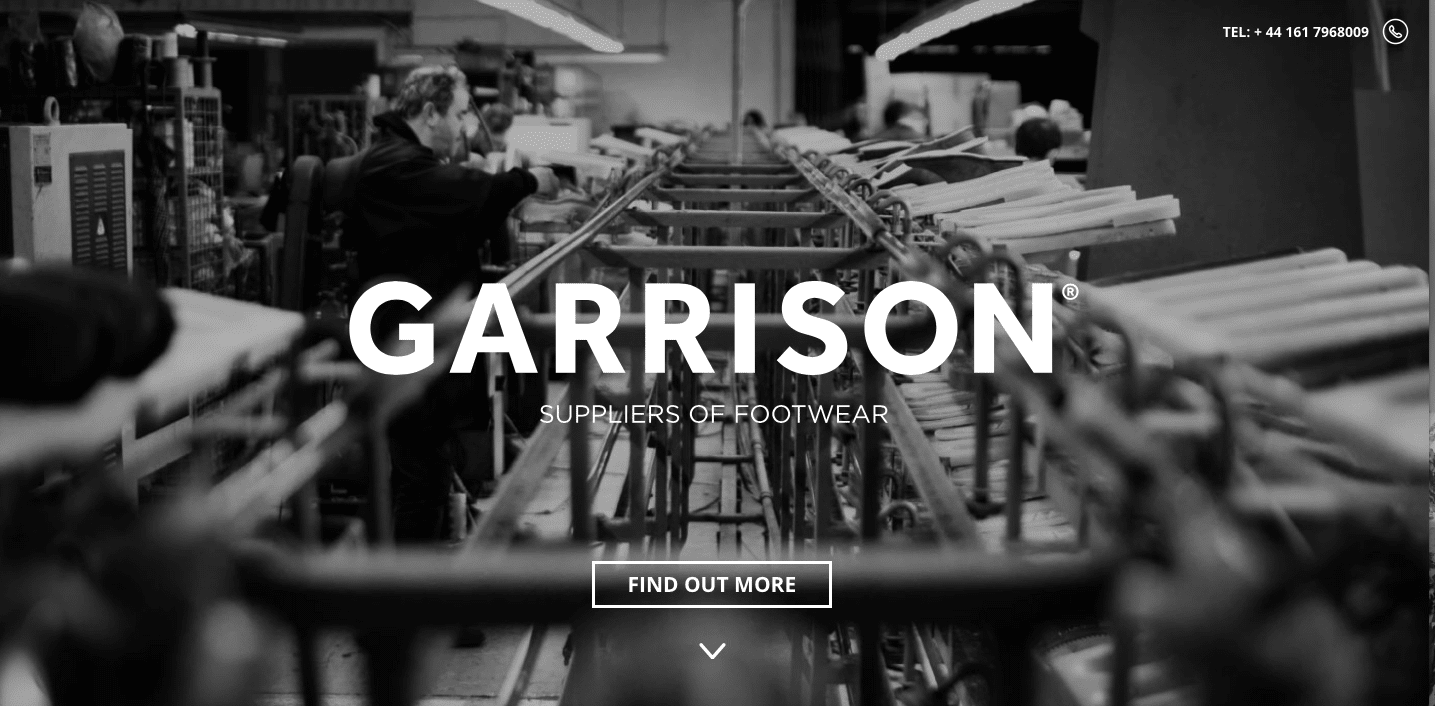
UK based Garrison Suppliers of Footwear is, as the name mentions, a footwear design and supply company. Their Website takes a minimalistic approach, with bare minimum copy, an easy, quick flow and an emphasis on nice, large images ranging from color pics and black-and-white photos to sketches – all of us are a sucker for visuals, after all.
Every Last Drop
The British sure have a thing for innovation – UK based Every Last Drop is a very informative Website which educates audiences about how much we consume every day. The minute you land up on their page, after the moon transforms into Mr. Sun, as you scroll through the main character’s journey from day to night, you get to see side-by-side statistics regarding our consumption, whether it be showering and clothing to eating and traveling. At the very end of the journey, information about their film project and partners is accessible. In short – the user experience of Every Last Drop is smart, engaging and creative.
We Shoot Bottles
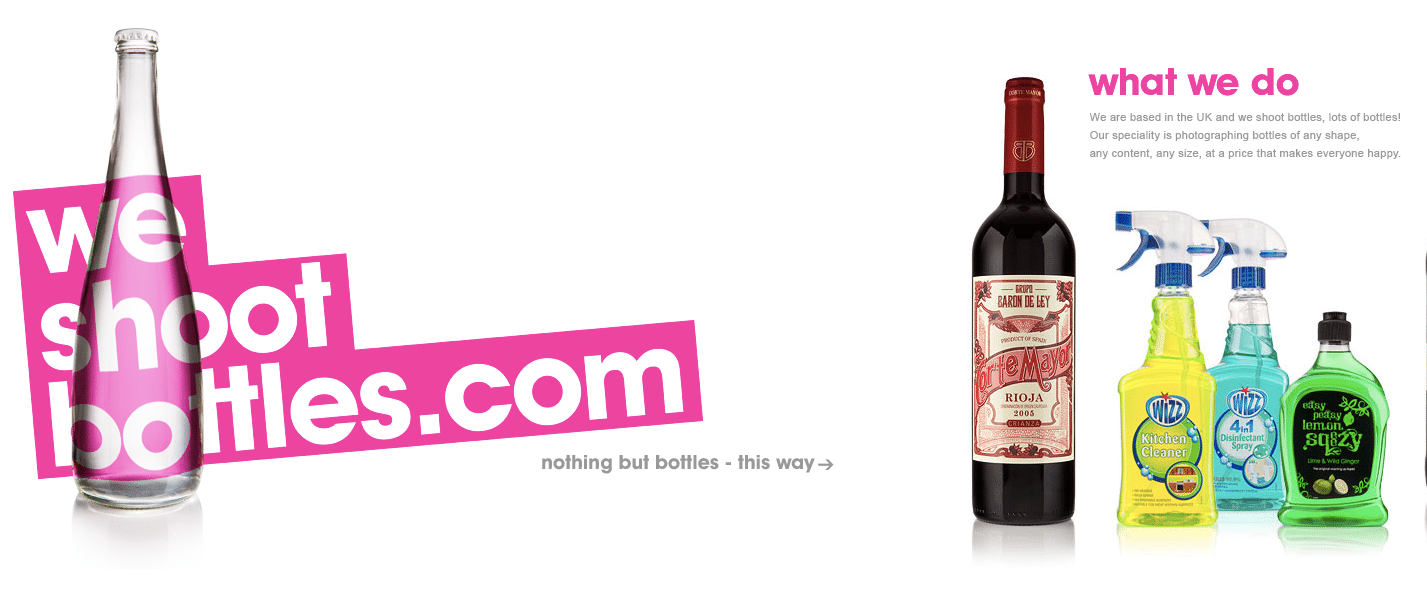
Who would have thought one could run a business of just photographing bottles? Looks like extreme specialization really is the new ‘in’ thing! This UK based company shoots bottles and their Website takes a unique approach of a left to right scroll rather than top to bottom, and we love it. The fun images of bottles, easy on the eyes color palette, minimal copy all puts together an engaging visual journey.
Foxy Casino
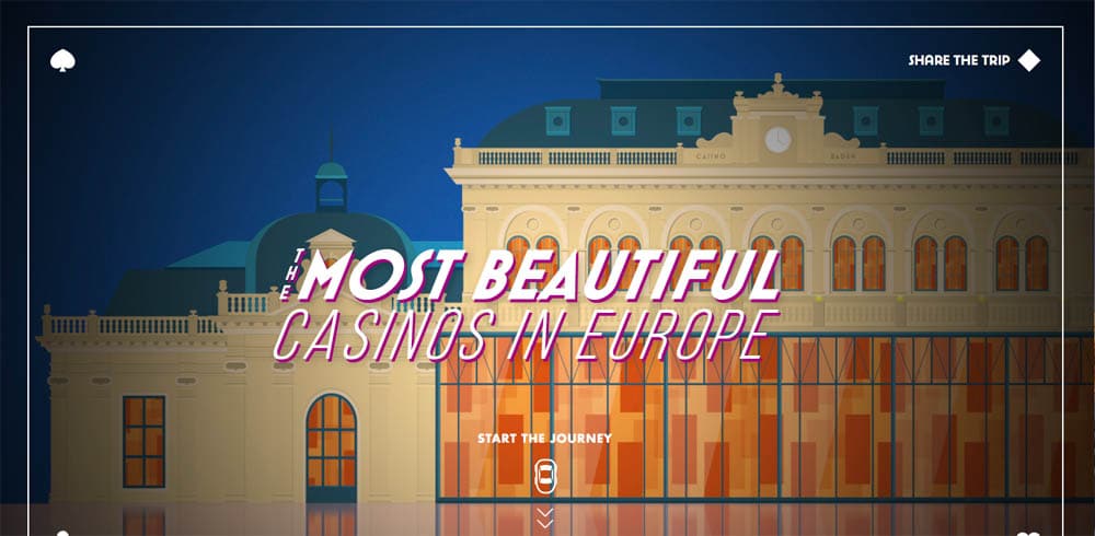
Wondering where the best casinos in Europe are located? Thinking of planning a crazy road trip? How about a casino hopping adventure through Europe? Foxy Casino’s single-page microsite showcases the best casinos in Europe through a fun journey from top to bottom of the page, with snapshots of each casino and a map on the right side of the screen, which illustrates how to plan this fun road trip – pretty neat!
Vinyl Day
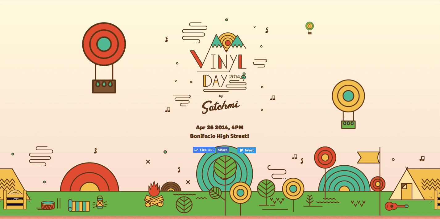
Philippines based music festival, Vinyl Day, is a colorful, vibrant one-page Website which uses a simple and warm approach to take audiences through information about their music festival, bands performing, sponsors and more – we love how they took a cartoonish approach to showcasing all elements, including the artists, rather than using literal photos. If their festival was anything near as fun as their Website, then we are sure their audiences must have had a fabulous time!
So, which of these five one-page websites did you like the most? Comment below and let us know. And, if there are any amazing single-page Websites you’ve spotted don’t forget to share them with us, too!


