-
Jul 05 2017 Here’s Why Your Website Has No Traffic!
So, you’ve built a Website and it has been up and running for a few weeks, perhaps even months. And, now you’re scratching your head. Why? Because you don’t have the slightest clue as to why you aren’t getting traffic. Does this scenario sound a bit too familiar? Here are four potential reasons you aren’t getting any traffic.
1.Your Content Sucks
If your content is not good enough and the quality of your Website is mediocre, don’t expect much traffic. There are plenty of competitors who are taking time out to invest in high quality content, and they are going to beat you to the race. Also, poor quality content is not going to get shared on social media. There is a reason people say content is king. Get your act together.
2. Your Website is Slow
People don’t have much patience. Everyone has a short attention span. So, a Website that takes forever to load is going to impact how much traffic you get. It is important to note that page speed is a huge ranking factor – users will only revisit your Website if it loads fast. Any Website that takes more than 4-5 seconds to load is going to result in people disappearing faster than imaginable.
3. Your Website’s Design is Horrible
If your Website has a horrendous design, that means it probably isn’t user-friendly. So, how do you expect there to be any recurring users? The way your site looks, feels, and functions has a direct impact on how users engage with your site, and if they even feel like engaging with your site at all, actually.
4. You Aren’t Even Bothering to Market
It is time for a much-needed reality check, my friend. Simply putting up a Website does not magically result in thousands of page views, even if your content is decent. Shocked? Until you get roughly 10,000 subscribers, spend as much time as you can to promote your site. If you can’t promote your own site, don’t expect others to do it for you. Remember how long it took to develop your Website? You should be spending even more than that amount of time on marketing. Be seen to be sold – that is the bottom-line.
Are you still struggling? Do you need help in revamping your Website? Contact us right here.
-
Jun 27 2017 Importance of Investing in a Good Coder
One thing we keep overhearing others talk about is how difficult it is to find the right coder – many people have nightmare stories they share. This is why we have decided to go ahead and explain why it is essential you take time and resources out to find a qualified and solid coder, rather than settle for someone mediocre who simply because they are easier on the wallet.
First of all, in case you are still confused about what a coder really is supposed to do, coders are specialists within an area of computer programming, whether it be computer programming, web developing and coding or software engineering. And, it is pretty difficult to find a good coder because – 1) It is difficult to find someone who will share your vision, especially if you aren’t good at communicating in technical terms 2) Coders are good at coding – they’d don’t quite understand businesses 3) A good coder can be costly 4) They often have a reputation of being lazy, looking for smart shortcuts to simplify things (which, is actually a good thing, if you look at it from a big picture perspective)
 CREDIT SOURCE AS: Image Courtesy: Entrepreneur.com Now, while it might be tempting to settle for a coder who doesn’t charge much and isn’t as experienced, a bad coder is going to have a lot of issues – It is important to invest time and resources to find the perfect coder, though they are difficult to get a hold of, because – 1) A good coder brings clear thinking and reasoning to the table 2) They help fix bugs on your Website very quickly by understanding problems and troubleshooting like a genie 3) Good coders are adaptable, self-learners and communicate properly
1) They won’t be able to communicate clearly with you
2) They might not offer many inputs
3) They may rush and ignore details – this could be quite disastrous if an essential piece of coding goes wrong on your Website, especially if you are an e-commerce portal or an interactive forum.Hence, if you have a coding intensive site, think twice before bringing a coder on board – vet them to make sure they really will get the job done and are someone you can establish a long-term professional relationship with.
-
Jun 20 2017 Staying On Top of Web Design Trends
If you are just about to launch a new Website, or if if your current Website is in need of some major revamping, it would be a pretty good idea to begin familiarizing yourself with the latest Web design trends of 2017 to make sure your new (or, improved) Website does not look stale.
There are five key Web design trends, around the globe, which we have been noticing this year
1. Bold Typography
Bold is indeed beautiful. Since audiences have short attention spans and are constantly bombarded with beautiful images all the time, thanks to social media turning into a JPG fairyland, Web designers have noticed emphasis on bold and eye-catching typography is a necessity in retaining eyeballs.
2. GIFs and Animation
Dreams vs Reality #dreamcatcher #dreams #dreambig #livingthedream #dreamers #funny #funnyshit #funnymemes #funnyvideos #hilariousaf #hilariousmemes #memes #memevideo #memes4life #memesdaily #instalife #instagram #instadaily #instagramers #instavideo #videos #professor #collegelife #nogirlfriend A post shared by GIFMOS (@gifmos) on
Short animated clips, especially GIFs, have picked up popularity across all forms of digital marketing, and they are finding their way onto official Websites quite steadily this year. Why? Because it makes the presentation of information a lot more fun and engaging.3. Minimalistic Design
There once was a time when more bells and whistles were the demand, but now, less is more. Web designers are focussing on minimalistic design, to maximize a user-friendly and visually-friendly experience. Websites are becoming a work of art, now.
4. Simple, Straightforward Copy
Hand-in-hand with minimalistic design also goes short and sweet copy that is clear, direct and simple to understand. As they say, it’s not what you say, it is HOW you say it that counts!5. Modular Design

More Websites are now opting for a modular design that keeps things on one page in different sections following a grid format. It makes it easier to access information in one go, and a modular design further helps with keeping things balanced and proportionate, visually speaking.IMAGE COURTESY: OnExtraPixel.com
Within India, specifically, there are two major trends we have noticed this year –
1. Mobile Optimization & Prioritization
As the population of Smart phone users continues to grow in India, Web designers have realized more people are viewing Websites on phones, instead of on desktops and laptops. Hence, mobile optimization has become a new and important priority when designing. Let us take a wild guess – you are reading this blog on your phone, aren’t you?
2. High-Quality Visual Content
Quality is something in which we don’t compromise on. It’s what everyone wants and also what we like to be known for. So now you know whom to contact for some Quality work ! ? #SquareSpace #DigitalMarketing #SocialMedia #Website #WebsiteDesign #Marketing #ArtrixTechnologies #Quality #Makeitbig #Callus #Letsdothis #CopyWriting A post shared by Artrix Technologies (@artrixtech) on
While many India-based Websites has mediocre design earlier, Web designers are stepping up their game. An increasing number of sites are focusing on high-quality visuals, both videos and photography. And, interestingly enough, most of these visuals are authentic, instead of the standard stock site rehashes.
We hope these pointers have helped you get a better picture of where things are at in the Web design space at the moment! For more information about all things Web design related, click here.
-
Mar 23 2017 Top 5 One-Page Websites to Inspire You
Let’s face it – we all have a short attention span. The “quickie” generation, we also equally love quick reads that are easy to skim through and absorb. Keeping this in mind, since the past few years, more and more Web designers are steering away from multi-page Websites to developing single-page / one-page Websites that offer an easy flow and fluid user experience – everything loads in one go, in one place and can be accessed through a simple scroll in one shot. Here are the top one-page Websites Kiss Doodles has spotted –
Garrison Suppliers of Footwear
UK based Garrison Suppliers of Footwear is, as the name mentions, a footwear design and supply company. Their Website takes a minimalistic approach, with bare minimum copy, an easy, quick flow and an emphasis on nice, large images ranging from color pics and black-and-white photos to sketches – all of us are a sucker for visuals, after all.
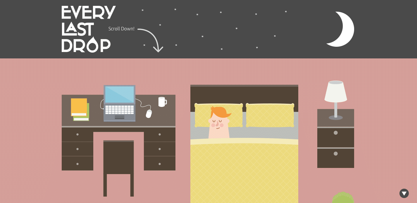
Every Last Drop
The British sure have a thing for innovation – UK based Every Last Drop is a very informative Website which educates audiences about how much we consume every day. The minute you land up on their page, after the moon transforms into Mr. Sun, as you scroll through the main character’s journey from day to night, you get to see side-by-side statistics regarding our consumption, whether it be showering and clothing to eating and traveling. At the very end of the journey, information about their film project and partners is accessible. In short – the user experience of Every Last Drop is smart, engaging and creative.
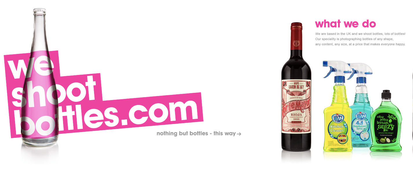
We Shoot Bottles
Who would have thought one could run a business of just photographing bottles? Looks like extreme specialization really is the new ‘in’ thing! This UK based company shoots bottles and their Website takes a unique approach of a left to right scroll rather than top to bottom, and we love it. The fun images of bottles, easy on the eyes color palette, minimal copy all puts together an engaging visual journey.
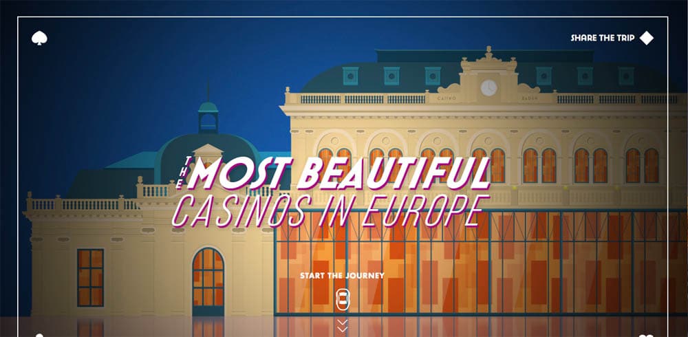
Foxy Casino
Wondering where the best casinos in Europe are located? Thinking of planning a crazy road trip? How about a casino hopping adventure through Europe? Foxy Casino’s single-page microsite showcases the best casinos in Europe through a fun journey from top to bottom of the page, with snapshots of each casino and a map on the right side of the screen, which illustrates how to plan this fun road trip – pretty neat!
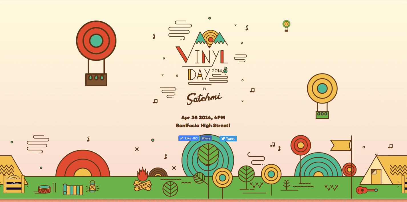
Vinyl Day
Philippines based music festival, Vinyl Day, is a colorful, vibrant one-page Website which uses a simple and warm approach to take audiences through information about their music festival, bands performing, sponsors and more – we love how they took a cartoonish approach to showcasing all elements, including the artists, rather than using literal photos. If their festival was anything near as fun as their Website, then we are sure their audiences must have had a fabulous time!
So, which of these five one-page websites did you like the most? Comment below and let us know. And, if there are any amazing single-page Websites you’ve spotted don’t forget to share them with us, too!


