-
Aug 23 2019 Does Your Website Have These 11 Essentials?
We’ve already taken a close look at why every brand needs a Website in today’s day and age when competition is cut-throat and maintaining a strong digital footprint is imperative. However, not anything and everything will make do. In fact, there are eleven important elements that make a Website robust. Let’s take a look at all of them right now, shall we?
1. Be Clear

Customers who happen to stumble across your Website shouldn’t be confused about what it is you exactly do, else they are going to bounce off your platform immediately, and that’s going to lower your SEO performance . Make sure there is a crystal clear description that is short and sweet about your products/services – and, it should be super easy to spot.
Pro Tip – Your Website should have a clear call-to-action, as well!
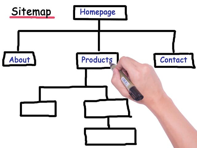
2. Site Map

A site map is an important element to include on your Website, even if there aren’t too many pages. It helps users navigate your site smoothly and look at all the sections + subsections in one convenient place, in case they are having difficulty finding something. Do not miss this component!
Pro Tip – Also add a Search Engine on your Website.
3. Straightforward URL

Do not complicate your URL – it’ll be difficult for people to remember and pass along to others. Stick to your brand’s name, and preferably .com (which is most commonly used). In essence, your URL should have high recall value.
4. Easily Contactable

Contact info. Hyperlinked social media icons. Customer service chat-box. All of these features should be easily discoverable. Nothing frustrates a customer more than having to search for a way to get a hold of you should they need help or wish to receive assistance with an order / query.
5. Credibility Boosters

Testimonials. Reviews. Awards. Media coverage. Portfolio / case studies. Prestigious client tie-ups. Endorsements. Display your “social proof” proudly to boost your credibility. This works as a charm in swaying customers / clients in your direction over your competitors.
6. Smart Design

High-quality content User-friendly design. Mobile-friendly navigation. Stunning visuals. Hero shots. Smart headlines. Crisp sub-sections.These are all staple ingredients of any solid Website. Do not neglect these basics. If your site isn’t user-friendly, it will turn them off and impact SEO adversely!
Pro Tip – Do not forget to invest in a good logo. Microsoft Word Art is not going to cut it!
7. Appealing Offers

Convert site visitors into customers with an appealing offer they cannot resist. Are you an e-commerce portal? Offer a nice discount off first purchases upon subscription. Do you offer services to other companies? Offer a free trial of your service upon subscription.
8. Regularly Updated Blog

A blog is an important element of most Websites these days. They allow you to improve SEO. And, they also enable you to maintain your image as a thought leader. Furthermore, you can often repurpose content from your blog as social media content, killing two birds with one stone. Word of advice – do NOT turn comments off on your blog. Remember, the goal is to engage.
9. Security / Safety Measures

If users feel your Website isn’t very safe to use, they probably won’t want to make a transaction on your platform. Make sure your site is fully secure. And, if you’re dealing with customers in Europe, make sure it is also GDPR compliant.
10. Links & Tags

Don’t forget SEO basics when designing your site. Always use tags, meta-tags and try to cross-link within your Website so audiences can be redirected to co-related content and spend more time on your Website.
11. Update Regularly

Many brands forget to update their Website regularly. Just because you are current on your social media handles does not mean you can slack off on your Website. If you haven’t updated the Copyright date on your portal, that shows you’re lazy. If you haven’t updated your client roster, again, you’re showing you aren’t taking your own company’s achievements seriously. Make sure you set a date every month to update your Website properly. And, while you’re doing that, also cross-check analytics!
We hope these eleven essentials will guide you to revamp your Website so it does more for your business, moving forward. Need help with designing your Website? Contact our team right here.
Sources-
> www.entrepreneur.com/article/217499
> www.orbitmedia.com/blog/what-to-put-on-your-homepage/
> www.forbes.com/sites/forbesagencycouncil/2017/10/13/13-important-elements-to-include-when-designing-a-website/#17390c9568de
> www.poweredbysearch.com/blog/the-15-website-must-haves/ -
Jun 28 2019 Why FREE Website Templates Are A Bad Idea
It can be very tempting to use a free Website template when your brand is new – after all, who doesn’t want to save a bit of time and money, especially when you’re not entirely sure about the future of your business? But, there are six compelling reasons why you should NOT fall for the free Website template trap, and instead hire a pro to create a bespoke Website design tailored to your specific needs –
1. Lack Of Originality

First impression is often the last impression. Do you really want to use a generic-looking templated Website that will send the wrong message to your audience that you don’t even believe enough in your own brand to invest in something as simple as a properly designed Website? Tsk, tsk. Your Website is your brand’s calling card. It is your brand’s visual story. Don’t cut corners in this department by going the run-of-the-mill route.
2. Space Constrictions

A templated Website often has many constrictions surrounding space, layout and storage space. This can lead to a ton of unwanted compromises on the quality of content you try to cram in. This certainly isn’t a good idea if you believe in the age-old saying “content is king!”
3. Difficult To Learn

If you are over-confident that you can learn how to customize a template as per your needs, it is time for a reality check. Web designers have years of in-depth training to pull off what you’ll be trying to, that, too, in a fraction of the time you’ll be spending. You’re better off using your time on more important things like strategy, marketing, sales and advertising. Leave Web design to the pros who have access to the latest tools and information.
4. Security Threats

Templated Websites pose a major security threat – they are hacked more often. This could damage your chance of building trust with customers.
5. Not User-Friendly

Not only is a templated Website going to prevent your ability to offer a user-friendly experience to visitors, it is also going to piss them off. Why? Well, templated sites are 3-10x slower, which can also prove detrimental for SEO {can link to SEO blog when it is live}. Customers are more likely to log off your site if it is slow and difficult to go through. Furthermore, free website templates usually feature very archaic designs that aren’t optimized for different devices – again, this isn’t user-friendly.
6. No Support System

Whether you’re struggling to run security updates, or need tech support for other reasons, templated Websites can be a customer service nightmare when you need help urgently. You’ll pretty much be stuck trying to solve things on your own.
We hope these six reasons ward off any urge you have to try out a free Website template. Invest resources in a powerful Website that has responsive design, solid content, useful widgets, better analytics, strong security measures and fast loading time – it’ll help you leave the best first impression, improve your SEO and retain customers much more effectively.
Need help with putting together the most visually delightful Website for your brand? Don’t hesitate to get in touch with our team right here.
Sources –
> www.wpbeginner.com/opinion/36-reasons-why-having-a-free-website-is-a-bad-idea/
> www.imageworkscreative.com/blog/why-using-website-template-just-bad-idea
> https://espresso.digital/diy-business-website-design-bad-idea/


