-
Jul 01 2019 Are You Making These 8 Avoidable SEO Mistakes?
When it comes to your company’s business strategy and SEO quality, you simply cannot afford to go wrong, which is why it is important to steer clear of mistakes that can cause you grief. With a plethora of content being promoted online every second, the need to capture your target audience’s attention and keep it intact has reached its peak. More than 2 trillion searches are being made on Google annually, making SEO vital in helping your product/service get its due attention. Avoid these 8 SEO mistakes to create supreme, user-centric and powerful content –
Mistake 1 – Choosing Incorrect Keywords

Keywords play a major role in the world of optimization, which is why choosing the right ones is imperative for your website. Don’t neglect the preferences of search engines and users – avoid opting for long-tail keywords. Focus on words your potential customers use while referring to your products/services. A bit of background research pays off. You might find tools like SEMrush, Google Trends and Google Adwords KeywordPlanner helpful.
Mistake 2 – Missing Out On Mobile Users
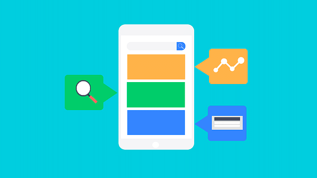
Smartphones are an indispensable part of our lives. Your content is bound to get negatively impacted if it is not mobile-friendly and responsive. Work on building SEO content targeted specially for mobile users to yield better results.
Mistake 3 – Publishing Poor Quality Pages
Coming up with meaningful content isn’t that difficult if you really plan it out properly, rather than rushing. Remember, haste makes waste. Poor quality pages do not add value to your page and might end up in the omitted results by Google! Also, if you think simply posting tons of high-res, pretty visuals is going to cut it, think again – algorithms NEED to see text, too!
Mistake 4 – Publishing Duplicate Content

According to Social Media Today’s findings, 65.88% sites have duplicate content. Duplicating content is a huge waste of both consumers’ time and Google’s resources – in fact, it might impact your SEO rankings negatively, altogether. In the world of SEO, having less, meaningful content is far better than publishing repetitive, low quality material.
Mistake 5 – Not Working On A ‘Google My Business’ Listing

Many businesses forget to claim and manage their Google My Business listing. While working on SEO content, do not forget the basic fact that Google places much importance on ‘near me’ searches. It helps small business reveal their address phone number and provide other relevant information, too.
Mistake 6 – Skipping Meta Descriptions & Title Tags
Simply including targeted keywords and coming up with quality content does not mean you’ve automatically optimized it. Essential elements of SEO, such as title tags and meta descriptions, must be included, too. It improves the content’s performance and ranking. Shockingly, a Social Media Today’s research indicates 63.28% sites have missing meta descriptions, and 53.99% sites even had duplicate meta descriptions; 10.53% missed out on title tags, 26.33% didn’t have enough text in the title tags and 53.23% had duplicate title tags. Goodness!
Mistake 7 – Being Unorganized With Internal Links

Social Media Today’s findings indicate 33.29% sites have broken internal links! Start using internal links to improve page views and time spent on your site by each visitor. Incorporate apt methods to give high-performing content enough visibility and attention. However, don’t go overboard, either – internal links should be added only if it is relevant and a value-add.
Mistake 8 – Failing To Add Relevant External Links

External links help provide relevant content, while also offering credibility to users and search engines. You can achieve this by ensuring all external links open in a new window, hence allowing users to access other content instantly, with the option of returning to your content with ease, too.
We hope you will go back and correct these eight common SEO mistakes soon! If you need help with SEO optimization, we are just one click away.
Sources –
> www.socialmediatoday.com/news/40-major-seo-mistakes-you-must-avoid-in-2019-infographic/548324/
> www.forbes.com/sites/forbesagencycouncil/2018/10/17/15-common-seo-mistakes-to-avoid/#6c50b1fbbe6a
> https://neilpatel.com/blog/seo-mistakes/
> https://cognitiveseo.com/blog/20859/major-seo-mistakes/
> www.toprankblog.com/2017/02/common-seo-mistakes-to-avoid/
> www.searchenginejournal.com/10-common-seo-mistakes/178734/#close -
Jun 28 2019 Why FREE Website Templates Are A Bad Idea
It can be very tempting to use a free Website template when your brand is new – after all, who doesn’t want to save a bit of time and money, especially when you’re not entirely sure about the future of your business? But, there are six compelling reasons why you should NOT fall for the free Website template trap, and instead hire a pro to create a bespoke Website design tailored to your specific needs –
1. Lack Of Originality

First impression is often the last impression. Do you really want to use a generic-looking templated Website that will send the wrong message to your audience that you don’t even believe enough in your own brand to invest in something as simple as a properly designed Website? Tsk, tsk. Your Website is your brand’s calling card. It is your brand’s visual story. Don’t cut corners in this department by going the run-of-the-mill route.
2. Space Constrictions

A templated Website often has many constrictions surrounding space, layout and storage space. This can lead to a ton of unwanted compromises on the quality of content you try to cram in. This certainly isn’t a good idea if you believe in the age-old saying “content is king!”
3. Difficult To Learn

If you are over-confident that you can learn how to customize a template as per your needs, it is time for a reality check. Web designers have years of in-depth training to pull off what you’ll be trying to, that, too, in a fraction of the time you’ll be spending. You’re better off using your time on more important things like strategy, marketing, sales and advertising. Leave Web design to the pros who have access to the latest tools and information.
4. Security Threats
Templated Websites pose a major security threat – they are hacked more often. This could damage your chance of building trust with customers.
5. Not User-Friendly

Not only is a templated Website going to prevent your ability to offer a user-friendly experience to visitors, it is also going to piss them off. Why? Well, templated sites are 3-10x slower, which can also prove detrimental for SEO {can link to SEO blog when it is live}. Customers are more likely to log off your site if it is slow and difficult to go through. Furthermore, free website templates usually feature very archaic designs that aren’t optimized for different devices – again, this isn’t user-friendly.
6. No Support System

Whether you’re struggling to run security updates, or need tech support for other reasons, templated Websites can be a customer service nightmare when you need help urgently. You’ll pretty much be stuck trying to solve things on your own.
We hope these six reasons ward off any urge you have to try out a free Website template. Invest resources in a powerful Website that has responsive design, solid content, useful widgets, better analytics, strong security measures and fast loading time – it’ll help you leave the best first impression, improve your SEO and retain customers much more effectively.
Need help with putting together the most visually delightful Website for your brand? Don’t hesitate to get in touch with our team right here.
Sources –
> www.wpbeginner.com/opinion/36-reasons-why-having-a-free-website-is-a-bad-idea/
> www.imageworkscreative.com/blog/why-using-website-template-just-bad-idea
> https://espresso.digital/diy-business-website-design-bad-idea/ -
Jul 19 2017 5 Reasons You Should Re-Design Your Website
It can be tricky to determine if your Website needs to be revamped. It is easy to become complacent, and redesigning a site can be a pretty mammoth task. But, that could be detrimental to both branding and business. So, if you have a Website that has been up and running for a while now, here are five important questions to ask yourself to figure out if you should redesign it –
1. Has the purpose of your Website changed?
No, you do not need to redesign your entire Website every single time you adjust your marketing goals. However, if your marketing plans have changed drastically, you need to ask yourself if your Website is fully aligned with those goals. Everything needs to be cohesive.
2) Is your Website responsive?
People like to consume information on their mobile devices – in fact, over 60% Web traffic comes from such sources. So, if your Website isn’t responsive, you are going to lose business leads and customers. Do not take such a huge risk, and start optimizing your Website.
3. Is your Website sluggish?
Slow and steady wins the race is actually not always applicable. When it comes to Websites, speed is critical at many levels, from SEO, the amount of time users spend on your site and user-experience being offered. If your Website is slow, then it means it is poorly developed and/or your hosting platform is pretty bad. Don’t piss your audience off with a painfully slow Website. Just don’t.
4. Is your home page cluttered?
Your Website shouldn’t look like a messy scrapbook. Excessive content is overwhelming for a user to see on a Website. As we’ve mentioned in an earlier blog post, users do not want to read endless paragraphs of content the very first time they are being exposed to a new brand. It is a huge turn off. Your homepage should express your core values, the real purpose of your brand and what it has to offer.
5. Can people reach out to you?
This might seem obvious, but surprisingly many companies forget to display sufficient contact information. Customers want brands to be available – it establishes a sense of trust and security. Make sure a phone number and email ID is prominently available on your Website. Not including this vital information will result in users dropping off your site.v
-
Jul 12 2017 Does Your Website Have These Six Elements?
Are you feeling really depressed looking at your Website? Are the analytics reports of your Website pathetic? Okay, we get it – you are definitely wondering what exactly makes a Website great, aren’t you? There are six important elements that make a Website excellent. Does your Website have these six elements? Let’s find out –
1. Responsive Design
It is very normal for people to access websites from multiple devices with multiple screen sizes. This means you absolutely must consider if your website is mobile-friendly. This is a complete no-brainer. If your website is not mobile-friendly in a world where everyone is glued to their phones, you are seriously living under a rock. Rebuild your Website it in a responsive layout, or you can even build a dedicated mobile site.
2. Minimalism
Less is more. Repeat this until you believe it. Many businesses are taking Web design back to the basics with minimalistic designs and layouts. People cringe at clutter. Websites should feature fewer pages, with simpler designs and more blank space. THIS is what maintains more interest.
3. User-Friendly
You need to cater to your audiences. A simple and intuitive navigation is another very important feature you must focus on. If your customers can’t easily get around your Website, then they are not going to stay for long and they are definitely not going to come back again.
4. Typography
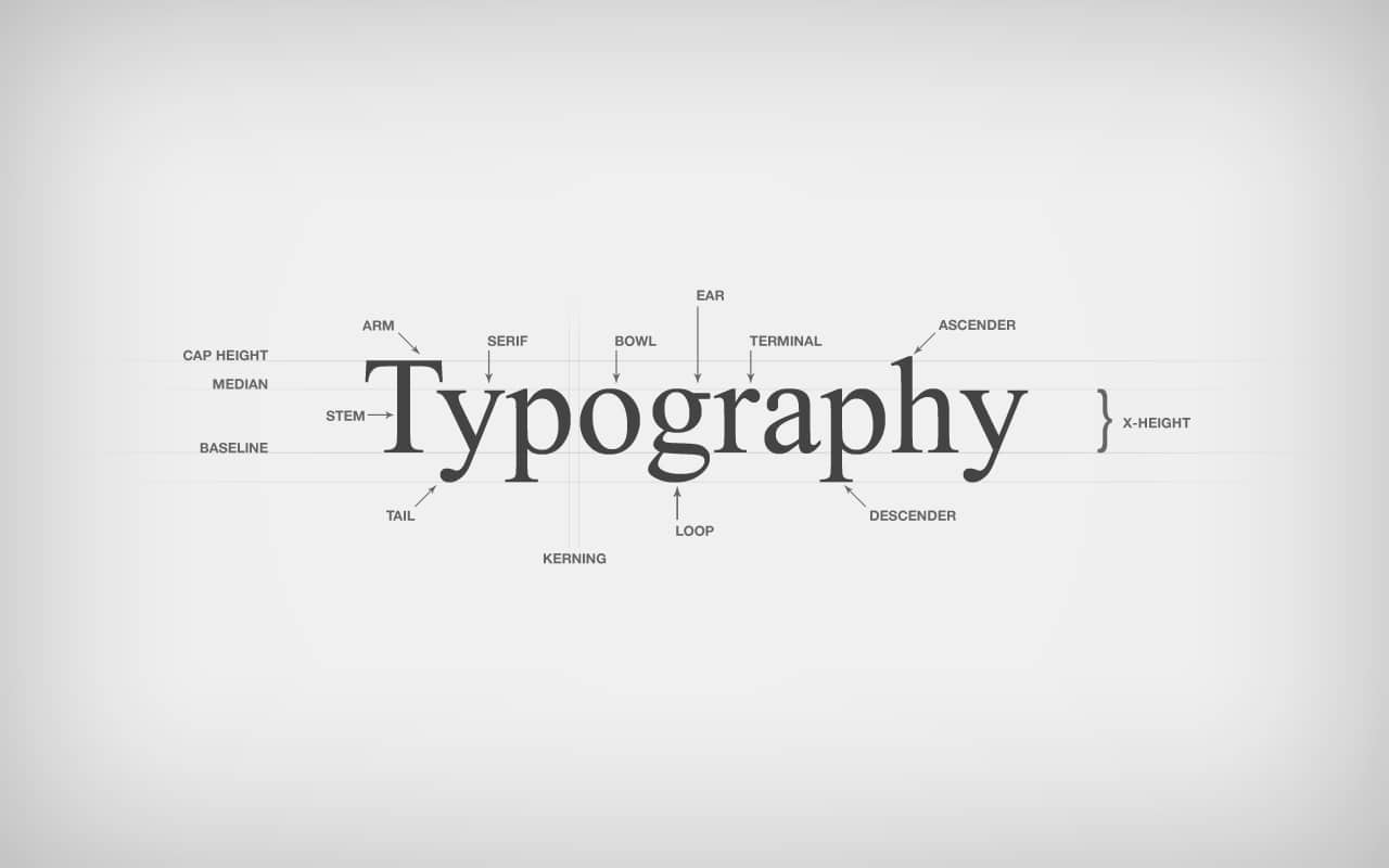
You need to go easy on the eyes! In general, Sans Serif fonts such as Arial and Verdana are a lot easier to read online. And, the ideal font size for quick-and-easy online reading is 16px (stick to a maximum of 3 types of sizes in your design flow). Selecting the right font will definitely play a huge role in making or breaking your Website.
5. Get Nitty Grid-dy
Grid-based layouts are in. Placing content randomly on your Web page can end up looking very messy. However, grid-based layouts arrange content into nice and neat sections, columns and boxes that line up and feel aligned. THIS looks and feels like proper Website design.
All Image Courtesy: giphy.com
You can check out more Website do’s and don’ts from our team right here.
Do you need some help in improving your Website? Or, are you thinking of building a brand new Website? Contact us.
-
Jul 05 2017 Here’s Why Your Website Has No Traffic!
So, you’ve built a Website and it has been up and running for a few weeks, perhaps even months. And, now you’re scratching your head. Why? Because you don’t have the slightest clue as to why you aren’t getting traffic. Does this scenario sound a bit too familiar? Here are four potential reasons you aren’t getting any traffic.
1.Your Content Sucks
If your content is not good enough and the quality of your Website is mediocre, don’t expect much traffic. There are plenty of competitors who are taking time out to invest in high quality content, and they are going to beat you to the race. Also, poor quality content is not going to get shared on social media. There is a reason people say content is king. Get your act together.
2. Your Website is Slow
People don’t have much patience. Everyone has a short attention span. So, a Website that takes forever to load is going to impact how much traffic you get. It is important to note that page speed is a huge ranking factor – users will only revisit your Website if it loads fast. Any Website that takes more than 4-5 seconds to load is going to result in people disappearing faster than imaginable.
3. Your Website’s Design is Horrible
If your Website has a horrendous design, that means it probably isn’t user-friendly. So, how do you expect there to be any recurring users? The way your site looks, feels, and functions has a direct impact on how users engage with your site, and if they even feel like engaging with your site at all, actually.
4. You Aren’t Even Bothering to Market
It is time for a much-needed reality check, my friend. Simply putting up a Website does not magically result in thousands of page views, even if your content is decent. Shocked? Until you get roughly 10,000 subscribers, spend as much time as you can to promote your site. If you can’t promote your own site, don’t expect others to do it for you. Remember how long it took to develop your Website? You should be spending even more than that amount of time on marketing. Be seen to be sold – that is the bottom-line.
Are you still struggling? Do you need help in revamping your Website? Contact us right here.
-
Jun 27 2017 Importance of Investing in a Good Coder
One thing we keep overhearing others talk about is how difficult it is to find the right coder – many people have nightmare stories they share. This is why we have decided to go ahead and explain why it is essential you take time and resources out to find a qualified and solid coder, rather than settle for someone mediocre who simply because they are easier on the wallet.
First of all, in case you are still confused about what a coder really is supposed to do, coders are specialists within an area of computer programming, whether it be computer programming, web developing and coding or software engineering. And, it is pretty difficult to find a good coder because – 1) It is difficult to find someone who will share your vision, especially if you aren’t good at communicating in technical terms 2) Coders are good at coding – they’d don’t quite understand businesses 3) A good coder can be costly 4) They often have a reputation of being lazy, looking for smart shortcuts to simplify things (which, is actually a good thing, if you look at it from a big picture perspective)
 CREDIT SOURCE AS: Image Courtesy: Entrepreneur.com Now, while it might be tempting to settle for a coder who doesn’t charge much and isn’t as experienced, a bad coder is going to have a lot of issues – It is important to invest time and resources to find the perfect coder, though they are difficult to get a hold of, because – 1) A good coder brings clear thinking and reasoning to the table 2) They help fix bugs on your Website very quickly by understanding problems and troubleshooting like a genie 3) Good coders are adaptable, self-learners and communicate properly
1) They won’t be able to communicate clearly with you
2) They might not offer many inputs
3) They may rush and ignore details – this could be quite disastrous if an essential piece of coding goes wrong on your Website, especially if you are an e-commerce portal or an interactive forum.Hence, if you have a coding intensive site, think twice before bringing a coder on board – vet them to make sure they really will get the job done and are someone you can establish a long-term professional relationship with.
-
Jun 20 2017 Staying On Top of Web Design Trends
If you are just about to launch a new Website, or if if your current Website is in need of some major revamping, it would be a pretty good idea to begin familiarizing yourself with the latest Web design trends of 2017 to make sure your new (or, improved) Website does not look stale.
There are five key Web design trends, around the globe, which we have been noticing this year
1. Bold Typography
Bold is indeed beautiful. Since audiences have short attention spans and are constantly bombarded with beautiful images all the time, thanks to social media turning into a JPG fairyland, Web designers have noticed emphasis on bold and eye-catching typography is a necessity in retaining eyeballs.
2. GIFs and Animation
Dreams vs Reality #dreamcatcher #dreams #dreambig #livingthedream #dreamers #funny #funnyshit #funnymemes #funnyvideos #hilariousaf #hilariousmemes #memes #memevideo #memes4life #memesdaily #instalife #instagram #instadaily #instagramers #instavideo #videos #professor #collegelife #nogirlfriend A post shared by GIFMOS (@gifmos) on
Short animated clips, especially GIFs, have picked up popularity across all forms of digital marketing, and they are finding their way onto official Websites quite steadily this year. Why? Because it makes the presentation of information a lot more fun and engaging.3. Minimalistic Design
There once was a time when more bells and whistles were the demand, but now, less is more. Web designers are focussing on minimalistic design, to maximize a user-friendly and visually-friendly experience. Websites are becoming a work of art, now.
4. Simple, Straightforward Copy
Hand-in-hand with minimalistic design also goes short and sweet copy that is clear, direct and simple to understand. As they say, it’s not what you say, it is HOW you say it that counts!5. Modular Design

More Websites are now opting for a modular design that keeps things on one page in different sections following a grid format. It makes it easier to access information in one go, and a modular design further helps with keeping things balanced and proportionate, visually speaking.IMAGE COURTESY: OnExtraPixel.com
Within India, specifically, there are two major trends we have noticed this year –
1. Mobile Optimization & Prioritization
As the population of Smart phone users continues to grow in India, Web designers have realized more people are viewing Websites on phones, instead of on desktops and laptops. Hence, mobile optimization has become a new and important priority when designing. Let us take a wild guess – you are reading this blog on your phone, aren’t you?
2. High-Quality Visual Content
Quality is something in which we don’t compromise on. It’s what everyone wants and also what we like to be known for. So now you know whom to contact for some Quality work ! ? #SquareSpace #DigitalMarketing #SocialMedia #Website #WebsiteDesign #Marketing #ArtrixTechnologies #Quality #Makeitbig #Callus #Letsdothis #CopyWriting A post shared by Artrix Technologies (@artrixtech) on
While many India-based Websites has mediocre design earlier, Web designers are stepping up their game. An increasing number of sites are focusing on high-quality visuals, both videos and photography. And, interestingly enough, most of these visuals are authentic, instead of the standard stock site rehashes.
We hope these pointers have helped you get a better picture of where things are at in the Web design space at the moment! For more information about all things Web design related, click here.
-
Jun 12 2017 Website 101 – Why, Do’s & Don’ts!
Taking into account that the vast majority of people spend a substantial amount of time online, on their phones, tablets, laptops, desktops, and traditional means of reaching out to customers, such as print catalogs and brochures have died down, it is extremely important to have an official Website for your business for three key reasons
1. A Website establishes credibility – you can showcase your work, portfolio, case studies, testimonials, products and services and offer interactive demos; a Website helps demonstrate what is unique about your business.
2. A Website makes you available 24/7 for both regular and potential customers to visit, including when your store or office is closed.
3. A Website makes it possible to target a wider market through SEO optimization, when potential customers are searching for similar services or products.
Now that we have you convinced that a Website is indeed important, let’s talk about some do’s and don’ts, because chances are you are overwhelmed with the thought of setting one up.
Do’s:
 1. Use easy-to-read and simple colors and fonts, given the fact most people access Websites on their mobile devices.
2. Make your site user-friendly by creating navigation bar, bucket your content by theme and directing the focus and flow of information.
3. Add business reviews to your website homepage to establish trust.
4. Keep it clear, simple, distinct and high quality – use a proper balance of typography and images.
5. Most importantly, plan properly on paper by making a site map and gathering all of the content you need and saving it into one folder.
6. Make sure you provide detailed information about your background, experience, contact information and other credentials that give you credibility in the eyes of potential customers.
Image Courtesy: GeekWebDesigns.com
Don’ts:
 1. Don’t make it hard for visitors to find what they are looking for or they will leave within 10 seconds. Do NOT make users think, wait or read endlessly. People have short attention spans, and first impression really is the last impression.
2. Don’t undervalue the power of strong SEO – your competitors are becoming savvier day-by-day (remember that!).
3. Don’t forget to test your Website in different browsers and on mobile devices.
4. Don’t use illegal content and make sure you have the rights to use images you have selected.
Image Courtesy: CreativeCuriosity.com
So, how exactly do you go about building your first Website?
1. Purchase a domain name and also check if social media handles are available for the same name, to ensure branding consistency
2. Decide if you want a static or dynamic Website.
> Static Websites are quick and cheap to develop and host. However, they require web development expertise to update and content can become stagnant and un-useful for audiences.
> Dynamic Websites are much more functional, easier to update and offers new content to keep audiences returning regularly (which helps with SEO rankings). However, dynamic Websites are slower, more expensive to develop and cost more to host.
3. Determine if you want to learn how to build a Website on your own through free resources like Wix and WordPress, or if you want to hire an agency or freelancer to do the needful for you, given they bring expertise and additional ideas to the table, taking the stress of learning an entirely new skill set off your shoulders!
4. Pick between WordPress or HTML –
> WordPress has a lot of advantages, such as it is easy to update, the templates they offer are very professional-looking and powerful and it offers full control and ownership to you at all times to easily update content. However, it does require a bit of learning and maintenance.> With HTML Websites, the requirements and maintenance are pretty low, although you cannot really make any updates if you wish to later on unless you know HTML/CSS, which is not really practical at a beginner level. Even small tasks like adding new pages, updating old content and uploading videos/images will require a Web developer, making it a tedious process. Furthermore, if your business grows and you want to add features like an online store, blog or subscribe button, you will need to coordinate with your Web developer, and often times they will push you to mitigate to WordPress, making this a costly affair in the long-run.
If you are still looking for more information about building a Website for your business, get in touch with our team at Kiss Doodles using the contact form here
-
Mar 23 2017 Top 5 One-Page Websites to Inspire You
Let’s face it – we all have a short attention span. The “quickie” generation, we also equally love quick reads that are easy to skim through and absorb. Keeping this in mind, since the past few years, more and more Web designers are steering away from multi-page Websites to developing single-page / one-page Websites that offer an easy flow and fluid user experience – everything loads in one go, in one place and can be accessed through a simple scroll in one shot. Here are the top one-page Websites Kiss Doodles has spotted –
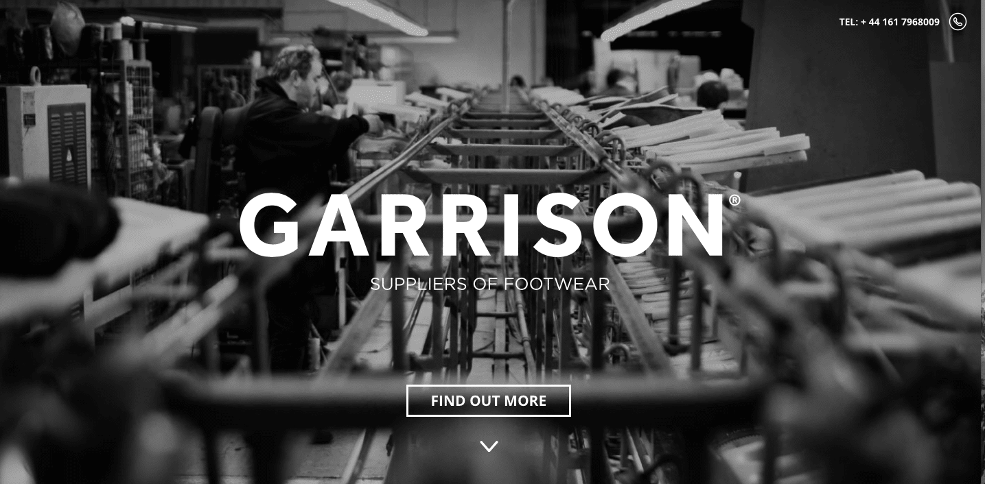
Garrison Suppliers of Footwear
UK based Garrison Suppliers of Footwear is, as the name mentions, a footwear design and supply company. Their Website takes a minimalistic approach, with bare minimum copy, an easy, quick flow and an emphasis on nice, large images ranging from color pics and black-and-white photos to sketches – all of us are a sucker for visuals, after all.
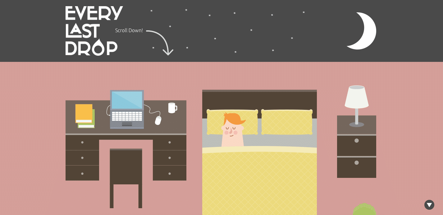
Every Last Drop
The British sure have a thing for innovation – UK based Every Last Drop is a very informative Website which educates audiences about how much we consume every day. The minute you land up on their page, after the moon transforms into Mr. Sun, as you scroll through the main character’s journey from day to night, you get to see side-by-side statistics regarding our consumption, whether it be showering and clothing to eating and traveling. At the very end of the journey, information about their film project and partners is accessible. In short – the user experience of Every Last Drop is smart, engaging and creative.
We Shoot Bottles
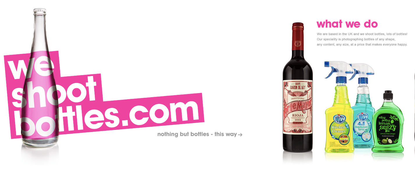
Who would have thought one could run a business of just photographing bottles? Looks like extreme specialization really is the new ‘in’ thing! This UK based company shoots bottles and their Website takes a unique approach of a left to right scroll rather than top to bottom, and we love it. The fun images of bottles, easy on the eyes color palette, minimal copy all puts together an engaging visual journey.
Foxy Casino
Wondering where the best casinos in Europe are located? Thinking of planning a crazy road trip? How about a casino hopping adventure through Europe? Foxy Casino’s single-page microsite showcases the best casinos in Europe through a fun journey from top to bottom of the page, with snapshots of each casino and a map on the right side of the screen, which illustrates how to plan this fun road trip – pretty neat!
Vinyl Day
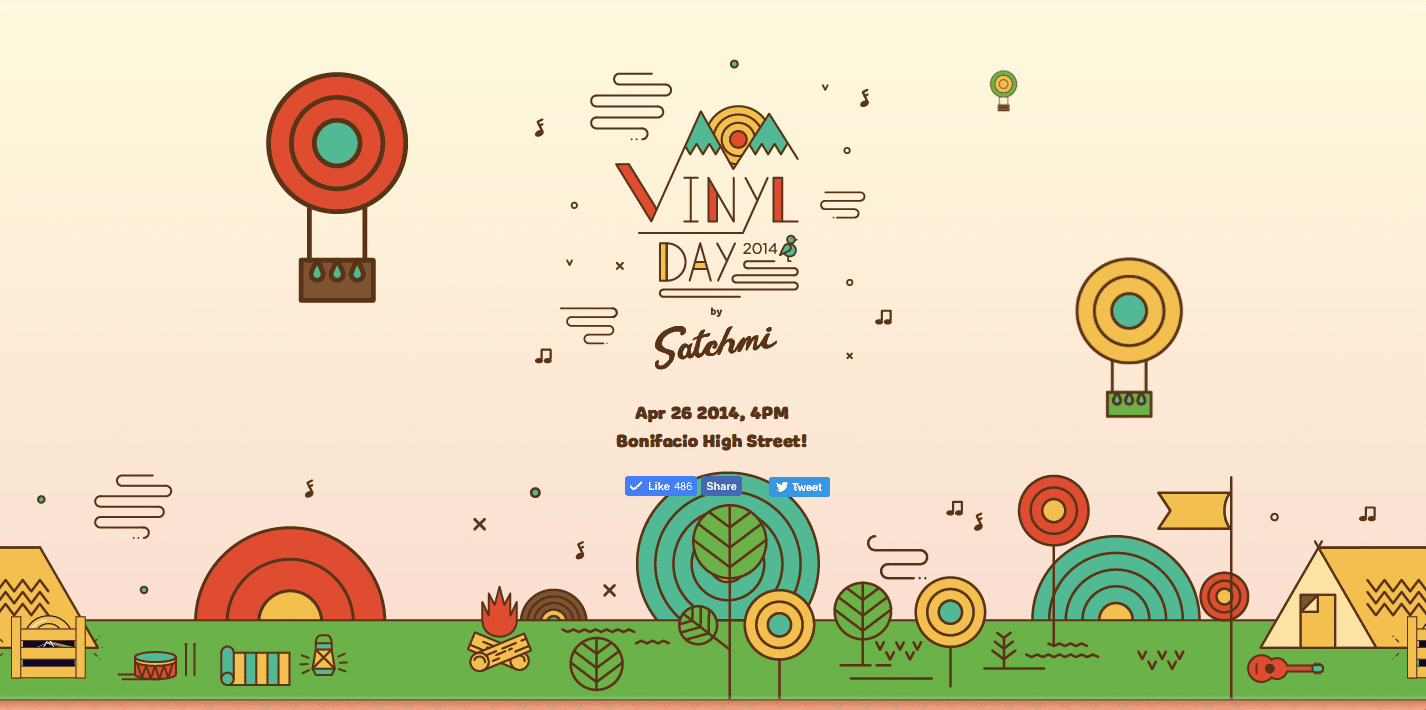
Philippines based music festival, Vinyl Day, is a colorful, vibrant one-page Website which uses a simple and warm approach to take audiences through information about their music festival, bands performing, sponsors and more – we love how they took a cartoonish approach to showcasing all elements, including the artists, rather than using literal photos. If their festival was anything near as fun as their Website, then we are sure their audiences must have had a fabulous time!
So, which of these five one-page websites did you like the most? Comment below and let us know. And, if there are any amazing single-page Websites you’ve spotted don’t forget to share them with us, too!
- 1
- 2


