-
Jul 29 2019 Does Your Social Media Editorial Calendar Check All These Boxes
A social media content calendar is a great tool because it –
* Allows you to brainstorm new ideas and assess what is / isn’t working
* Helps you plan your SM posts well in advance
* Prevents lags in posting consistency
* Ensures your design and copy teams provide everything in a timely fashion
* Assists with digital ad budgets
* Improves metrics / analysis at-a-glance
Let’s take a look at what elements should be a part of your social media editorial calendar (only use a spreadsheet for this!) so you can plan things more efficiently –
1) Dates
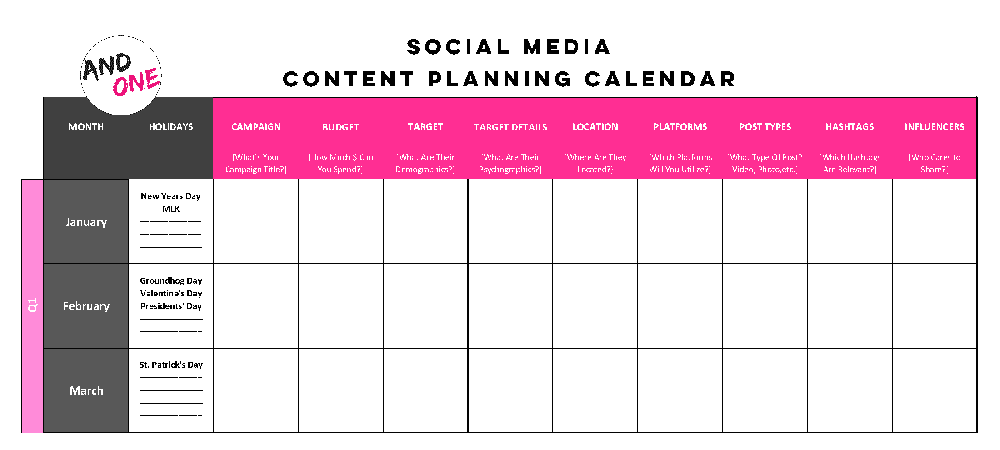
List out all the dates in the month so you can see which posts are going on what days and where the breaks are
2) Post Type

Enter a category for each post going up – i.e. photograph, video, throwback/flashback, testimonial, contest, motivational quote, infographic, etc. You can check if your content is varied enough or too tilted toward one direction (that would be monotonous)
3) Copy

Your copywriter(s) should enter the text for the graphics right here so your design team can copy + paste it easily
4) Caption

Your copywriter(s) should enter the caption accompanying the post when it goes up so your social media team can copy + paste it easily
5) Hashtags

Your social media team should plan out relevant hashtags per post in advance so they can copy + paste it easily
6) Platform

Specify if a post is going up on FB, Instagram, Twitter, LinkedIn, Google Plus, etc., so you can make sure all relevant platforms are receiving sufficient content that is varied (avoid duplicating posts across all platforms because that’s redundant for audiences)
7) Post Timing

Specify which posts should go up at what time based on insights you receive through analytics – this is especially important if you have multiple posts going out on the same day
8) Metrics

Input the number of likes/shares/comments/reshares each post is drawing to analyze what is / isn’t working
9) Point Person

Indicate point people for different tasks to guarantee accountability in case of errors / delays
10) Boost
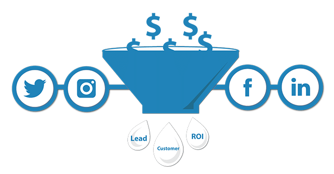
Indicate which posts should be boosted through a paid promotion, and indicate for how much + demographics/filters
11) Images / Videos

Mention where all the files are saved so the social media manager handling your handles has access to everything they need for posts to go live
12) Status
Allow a section for notes regarding status – is the copy ready, is the graphic ready, has the post been scheduled, is the post live?
Pro Tips –
* Mention any special days that should be addressed – i.e. if you run a pizza specialty restaurant, you definitely wouldn’t want to miss National Pizza Day for social media posts and hashtags.
* Make sure you conduct a social media audit using these tips to build the most robust mix of content.
We hope these tips help you stay organized on all your social media initiatives so nothing slips through the cracks, which is a risk when operating with a haphazard workflow system. Do the due diligence of putting everything into a documented file all relevant parties can access in real-time and update!
Need help with social media content creation and planning? Contact Kiss Doodles right here.
Sources –
> https://blog.hootsuite.com/how-to-create-a-social-media-content-calendar/
> www.hatchbuck.com/blog/monthly-social-media-calendar/
> https://coschedule.com/blog/annual-social-media-content-calendar/ -
Jul 05 2019 How To Have A Smooth Working Relationship With Your Design Team
If visual content is 40x more likely to get shared on social media platforms, which is what research indicates, then the importance of a design team cannot be emphasized enough! And, yet, nearly every brand has their design team horror stories to tell. Here are 6 tips to help you maintain a smooth working relationship with your graphic designers, whether it be an agency or a freelancer.
1. Value Good Design

The first step for a healthy professional relationship with your design team is to understand the value it carries. This means you should incorporate design from the strategy stage itself, not as an after-thought. It also means knowing how to be reasonable, both in terms of remuneration offered, variations requested, revisions solicited and turnaround time expected. This also means you shouldn’t ask for source files to “edit” on your own, because that’s usually offensive to most designers (you probably don’t know have the software or know how to manipulate files anyhow!).
2. Consider A Bespoke Working System

If you require creatives in a set turnaround time at fixed intervals, you may want to consider putting your design team and/or freelance designer on a fixed hours work-from-home retainer, where they allocate a certain number of hours on certain days to be on standby for artwork and/or revisions needed. Many agencies complain that they don’t receive work “fast enough” from designers – this system eliminates this issue altogether.
3. Communicate Openly

Open communication is THE most essential ingredient in any successful relationship, including professional ones, especially if you’re hoping to build a long-term one with your designer (which you should!). Ask them for their inputs about design strategy based on THEIR experience and expertise. Offer then specific feedback, rather than being vague when you’re unhappy with something they turn in. Figure out a system for workflow that meets the needs of both parties. It’ll save you a lot of grief.
4. Add An In-Person Element

When you are working with design teams and/or freelancers who are based out of other cities, having a quarterly or bi-annual in-person working session where you fly everyone down – designers, copywriters, marketing team, managers, etc. – into one location to brainstorm new ideas, discuss design trends, social media trends, new tools and technology, latest stats surrounding what has/hasn’t worked for your brand, etc. In-person energy can move a lot of mountains and bring about super creative ideas that wouldn’t be possible when everyone is scattered and never interacts face-to-face.
5. Be VERY Thorough

One of the easiest ways to run into huge trouble with your design team is to not be specific and detailed with them from the beginning. Offer them the following at the start of the project to minimize disappointment and endless back-and-forth –
* Mood board of references you like
* Brand book that specifies font choices, font sizes, brand primary colors, secondary/accent colors allowed, aesthetics, layout
* Reference folder of logo(s) + evergreen material on-file
* Editorial calendar of which piece is going out when so you can mutually back-track and set deadlines for draft 1, draft 2, final version(s)
* Detailed creative brief, including guidelines of information that must always be included (i.e. logo, SM handles, Website URL, email / phone, etc.) and layouts/dimensions (i.e. an Instagram post has very different dimensions from a FB cover pic)Do not, we repeat, DO NOT send your designer/team elements in bits and pieces – make sure they are provided everything they need in one go. Act professionally so you can set the tone for what you also expect in return.
6. Ask Questions Before Signing On

Although this might seem basic, you’d be surprised how often people ignore the importance of asking the right questions at the hiring stage. Check references and work samples. And, observe if you have any working chemistry with one another – if you can’t stand your designer in the interview process, chances are you’re not going to find them very pleasant later on, either! Offering a paid trial project is also a great way to test the waters before signing on for a long-term association.
We hope these 6 tips help you establish a healthy relationship with your design team that yields amazing visual content! If you need any help, reach out to us right here.
Sources –
> https://medium.com/designing-atlassian/7-tips-to-create-high-functioning-design-teams-part-1-1e0c9ea44f0d
> https://blog.percolate.com/2015/05/finding-a-creative-agency/
> www.huffpost.com/entry/8-best-tips-for-worki_b_5473608
> www.canva.com/learn/10-things-never-say-graphic-designer-probably/ -
Nov 29 2018 Loyal customers = Brand advocates?
Picture this. Your brand is in SERIOUS NEED of a boost and you need to do SOMETHING to move it forward. Let’s be fair here, not everyone has the budget to rope in an A-lister celebrity to endorse your brand.
So now what? What do you do? How do you get people to endorse you?

Start with baby steps, i.e. with your existing customers. You need people to trust your brand, and a good place to start will always be your existing customers. Especially the ones who make that repeat purchase.
They are the fans of your brand. They will tell you how much they love you and they show it by buying the products you’re endorsing, many a times neglecting things like the price or even their own personal requirement. Your product is their want and not necessarily their need.

via fortunedotcom.files.wordpress.com
For example: Those Apple customers that buy the latest iPad, Macbook Pro, iPhones, iPods and anything and everything that has ‘i’ in it. Whether it’s time to change their existing gadgets or not, they are right there, buying the latest piece of technology that Apple has to provide.
But as Steven Knox from Proctor and Gamble said, “Victory in marketing does not happen when you sell something, but when you cultivate advocates for your brand”
Brand advocates are those people who have no gains, no incentives, no motives, all in all, no reason to sell your brand to others. They will praise your brand for no personal gain and sometimes even without being a loyal customer. And THERE lies your most important resource.
For your brand to use the oldest marketing technique in the world, which is mouth-to-mouth marketing, you need to convert these existing customers into your brand advocates. And there are 2 very important reasons to do that.
Advocates are a brand’s best friend

via allidura.com
As a brand, you definitely will encounter retractors, specially today, when everyone is so verbal and vocal on social media. But before you have thought of a counter-attack and stepped in, there are already people defending your brand with passion. They have retaliated and done everything in their power to shoot down these retractors. They are your besties without benefits and that will always speak volume for your brand, sometimes better than you stepping up and clarifying.
All gain, minimum cost

And they did it for NO BENEFITS. No big fat cheques were given away and no incentives provided (yet). You did not have to break your FDs and piggy banks for the cause. THIS IS YOUR WIN-WIN SITUATION, WHICH YOU NEED TO GRASP WITH BOTH HANDS.
All this is well and good, but how do you make these God-sent people to endorse you?
Good service

Numbers ain’t everything! Retain your customers with good service as well. They’ll thank you then, and remember you later. Especially when talking to others. And voilà! Your job is done!
Offers & incentives

via www.sutexbank.in
We all like free goodies, don’t we? So do your brand advocates. They won’t ask for the free stuff, but they are definitely happy when they get it. This will make your brand stay in their mind and keep cropping up in conversations.
Don’t always focus on your potential customers, your existing customer is where the real gold lies. Nurture them to help you grow and reach the bigger market. After all in-house, no-budget influencers are every brand’s dream and all you need to do is get them is get into the vigilante mode.
-
Nov 20 2018 Art of communication: Never out of fad
“Lunch was amazing!” “Long tiring day, just need to go home.” or “My boss is a killjoy.” We Insta it, we tweet it, we are all about those long rants on Facebook. In short, we are very very social and giving out information liberally on social media, but are we any good at communicating?
NOPE. Communication today looks more like a scene of a car crash!
Communication ‘breaks down’ LITERALLY, when there is a glitch in
1. Channels of communication
WhatsApp is quick but a lot of important information is lost in transit, emails aren’t checked as regularly and a one-on-one isn’t really viable every time.
via whatsapp.net
Crucial information or worse urgent messages are missed and your team is in chaos.
2. Hearing v/s listening
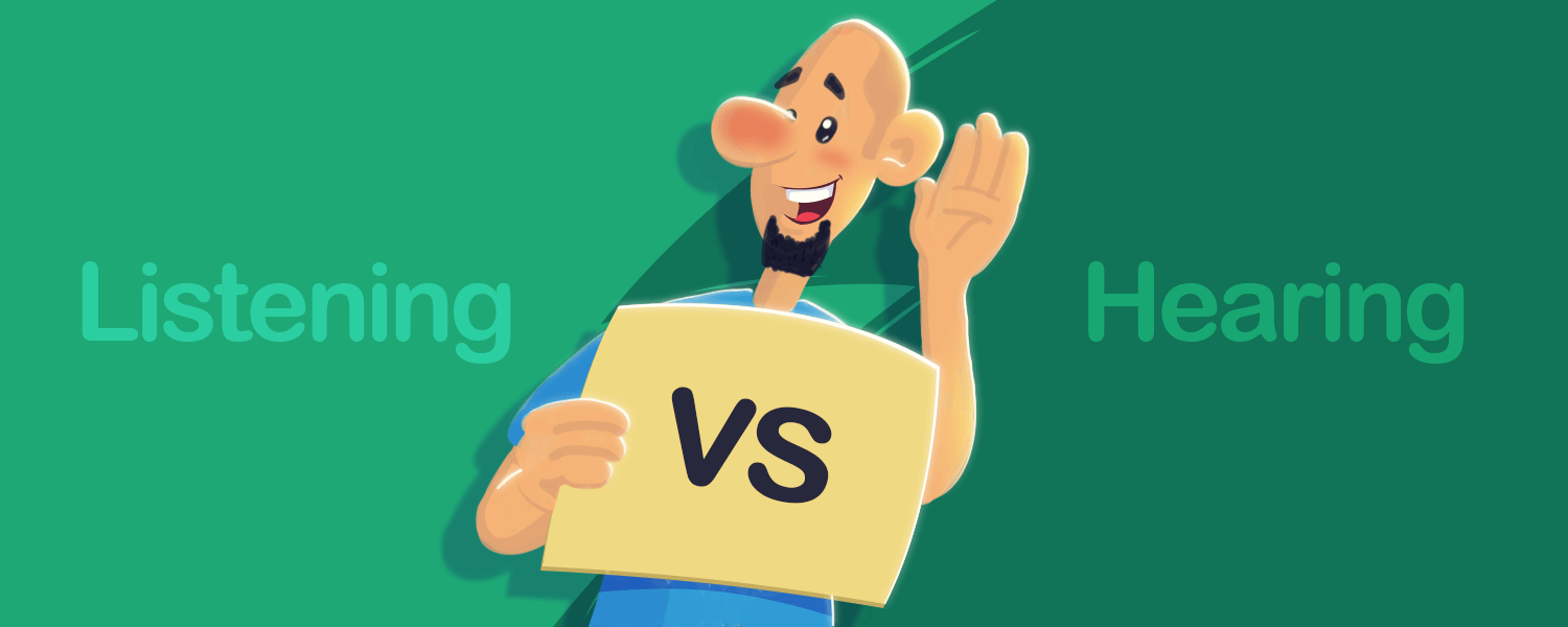
The business world isn’t called a rat race for nothing. Everyone wants to come first, everyone wants their word to be the first word and the last. Many a time (most times actually, but let’s be nice), we hear to speak but we don’t really listen.
via freshdesk.com
Or maybe even don’t hear at all. Bodily we are there but the mind wanders. Conclusion – There is a big GAP in the communicative line.3. Opinions matter…?
And then there is the age-old PROBLEM, of ‘what will people say’. We don’t think too much when we’re behind a screen, posting somewhat anonymously. Yet when you have a problem or an opinion and need to address the same to a peer or a senior, your first thought is how will your opinion be received, will you be judged or dismissed without being given a chance? The fear of embarrassment or humiliation stops us from having ‘an open conversation’ and well, problems occur.
For us as social beings, communication shouldn’t be that big of a deal frankly. It’s a matter of simply streamlining and choosing the right method for the right information.
4. EMAIL & TEXT
Who says you can only choose one method? Make a subject line that says urgent with a line on the important point of the email and simultaneously, drop a text saying ‘Check email pls, ASAP’.
via jobtrain.co.uk
A step extra taken will only start a pattern and a habit that will work in everyone’s favour.
5. Limit Time
Unless you’re talking of giving out bonuses or holidays (or both), people aren’t going to pay attention to much, after a certain time. So keep that meeting, discussion or ‘brainstorming session’ to 15 to 20 minutes. If it’s important and has emergency written all over it, then take a quick break and regroup.
via vectorstock.com
Rather waste the 5 minutes in-between than lose the concentration of all.6. Have fun
‘Why so serious?’ Said every person in every meeting ever! Or at least thought that. Two-way communication, smart anecdotes and relatable stories can keep a conversation engaging. It serves a dual purpose – people aren’t dying for that upcoming break and they remain ‘in’ the conversation, physically AND mentally.

via shopify.com
What seems easier isn’t always that easy, but it doesn’t have to remain the same way either. As music composer, John Powell rightly said, ‘Communication works for those who work at it.”
-
Oct 17 2018 Social Listening – Why is it important for your business?
As individuals, we might or might not be social media driven. Twitter may feel like a waste of time, latest filters on Instagram and Snapchat are alien concepts and Facebook may have run its course in your life.
But when we think of a brand, be it ourselves in the capacity of social influencers or a product/service selling brand, social media today is the key tool. From grabbing the attention of potential customers, promoting the latest creative; for that matter, even solving doubts and grievances of your existing customers, social media is a very important weapon in your arsenal.
Yet, with multiple portals providing different tools, how do you keep a track of who’s talking about your brand? Good, bad, neutral; everything that’s being said about you, should be in your knowledge. But the question remains: HOW?
Social Media Listening shows you real-time data of what is being said about you, without you having to go on individual platforms and searching for your name or product. A one-stop monitoring of all your social media pages, it gives you precise data of the mention of your brand, as it’s happening. Further analysis of the trends that have been set off by your metrics also are a click (or maybe a few clicks) away.
Here’s why social listening is a MUST-HAVE for your business:
1. KNOWLEDGE OF BRAND
You can find out how your business is perceived by your audience, as compared to your competitors. The stats can also be converted into reports that inform the clients, investors, for that matter, your own team of how and how much is your brand impacting your customers.

via immgsm.ac.za
2. TIME – SAVING
Brand tracking is easier as it helps you monitor multiple portals through one platform, saving time and the extra effort of going to each social media account separately.

via slipflop.com
3. AWARENESS IN REAL TIME
Getting that real-time data is vital for your business. Paying attention to not just where you’re tagged but also everything that’s mentioned about you, so you don’t have a FOMO moment when it comes to your brand.

4. FUTURE PLANNING
Having this information in hand also helps your marketing and sales team to plan their strategy. You can take notes of things that worked or did not work and accordingly move ahead with your plans.

5. FIND YOUR TRUE FANS
Word of mouth is the best way to grow your business. Through social listening, you can find the people who are advocating your brand and can reach out to them to help push your business further. These could be either your customers or an influencer.
via vimeo.com
As social media is a real-time industry, being conscious and aware all the time is important for your business success. With social listening, you can be on top of things and take your brand to a new level!
-
Oct 15 2018 Make your Instagram, Grid-friendly
Social media today, is dynamic. Trends are changing rapidly to grab the maximum attention. From worded content, to picture content and videos, digital-info consumption is evolving continuously. Instagram is about pictures & videos and we all keep looking for new ways of attracting potential digital traffic to your account and have them press that ‘follow’ button. The latest trendsetter with Instagram is the ‘grid’.
Grids are nothing but a set pattern which helps page owners attain the look that they have envisioned for their brand/page and eventually helps attract the digital traffic that your brand page is aiming for. Also, it’s always easier to work in a routine and Instagram grids are here to do just that. Specially if we are aiming to be the gen-next influencers that want the Instagram page to attract not just viewership, but also economic gains and business prospects.
3 CREATIVE (AND EASY) HACKS TO MAKE A GRID
1. CHECKERBOARD
Content that is ‘tile’ style. Make a visually appealing theme, alternating your posts between either two theme colours or alternating between a minimalistic slide and busier slide. Think of a pattern that resonates with your brand theme, showcases your CTA (call-to-action) and convinces a viewer to respond immediately. Not very difficult to maintain, just remember to alternate your posts correctly and the grid will maintain itself

via schedugr.am2. HORIZONTAL LINES
Do you want your Instagram page to tell a story, appealing to the people who are scrolling through your page? Travel, restaurant and pages that put up elaborate and picturesque posts, turn towards this style of planning their Instagram posts. It requires careful editing techniques to make a picture into 3 or 6 parts, maintain continuity in all pictures but also has a maximum impact on a viewer about to scroll down through your account
3. VERTICAL LINES
Only if you are prepared to be very very VERY committed to maintaining a grid, look no further. This grid simply requires you to maintain 3 equally attractive rows of content. Your visitors are now hooked on to the creativity (with discipline) exhibited and will keep scrolling down to look further into your brand and the variety of information you offer

via refinery29.comOther than the above, themes can also be maintained with a singular colour background or a single colour border. Something as simple as a plain white border can also help sustain a theme or grid.
Instagram grids give your visitors, instant gratification. A few scrolls and they get the gist of what your page is all about, your highlights and takeaways. Well-maintained grids in Instagram pages give that extra nudge to your visitors to not just ‘double-click’ a few pictures here and there but also add your account to their must-see list.
So choose your grid and start planning now!
-
Dec 18 2017 A Horn of Plenty or A Pandora’s Box?
As we all would agree, we live in an ever growing digital world, where life without social media seems impossible. Our vocabularies are familiar with the names YouTube, Instagram, Twitter, and Facebook and so on, and that seems only natural in today’s tech driven world. I can’t remember the last time I spent the day without accessing social media.
The ease with which we can access these platforms has made us familiar enough with them, however, it’s unfortunate that the familiarity can sometimes border on addiction. We tend to get our daily dose of news, entertainment and even validation from social media. In such a situation where our daily awareness comes from social media, how far-fetched is the concept and effect of manipulated news in our life?
The well-known proverb “no good news is news” can maybe be rephrased today as “all news is not true news”. Imagine waking up one morning and discovering that all your information was fabricated. I am fairly confident that most of us would experience shock and surprise. What is most surprising is the fact that although most adults are wary and suspicious of the information that they receive from these platforms, they still continue to look to the same for updates in our daily routine.
“Fake news”, as we all know, is a term popularized by President Donald Trump to define the ‘sold news’ system of social media. Though we may disagree on this simple generalisation we need to admit that there is an iota of truth to this term as well. To be honest, none of us are aware of the amount of fake news that we experience every day. So, it is only natural that we are suspicious of the news that we receive, especially from social media.
In a study conducted by Reuters about the scepticism surrounding news and media, only 24% of the sample vouched for the news that they received from social media, and 40% vouched for mainstream media. There is a sense of suspicion and doubt in both, but, social media was found to be more unreliable and for the right reasons. It is high time that people receive “true news” for we deserve to know the truth.
However, we do need to note that social media has a broader scope and does help cover sections of the news neglected by mainstream media like the LGBT community, the migrant crisis and so on and so forth. We do need to admit that news on social media does go into areas that are not dealt with by general media and surely has a valid & ever expanding purpose. We only wish that it was more validated & authentic and hence a reliable news source for those who access it.
As the Maya Angelou quote says “Know better, do better”, maybe online media should realise its roles and responsibilities and fulfil our needs of transforming into citizens of today.
-
Jul 19 2017 5 Reasons You Should Re-Design Your Website
It can be tricky to determine if your Website needs to be revamped. It is easy to become complacent, and redesigning a site can be a pretty mammoth task. But, that could be detrimental to both branding and business. So, if you have a Website that has been up and running for a while now, here are five important questions to ask yourself to figure out if you should redesign it –
1. Has the purpose of your Website changed?
No, you do not need to redesign your entire Website every single time you adjust your marketing goals. However, if your marketing plans have changed drastically, you need to ask yourself if your Website is fully aligned with those goals. Everything needs to be cohesive.
2) Is your Website responsive?
People like to consume information on their mobile devices – in fact, over 60% Web traffic comes from such sources. So, if your Website isn’t responsive, you are going to lose business leads and customers. Do not take such a huge risk, and start optimizing your Website.
3. Is your Website sluggish?
Slow and steady wins the race is actually not always applicable. When it comes to Websites, speed is critical at many levels, from SEO, the amount of time users spend on your site and user-experience being offered. If your Website is slow, then it means it is poorly developed and/or your hosting platform is pretty bad. Don’t piss your audience off with a painfully slow Website. Just don’t.
4. Is your home page cluttered?
Your Website shouldn’t look like a messy scrapbook. Excessive content is overwhelming for a user to see on a Website. As we’ve mentioned in an earlier blog post, users do not want to read endless paragraphs of content the very first time they are being exposed to a new brand. It is a huge turn off. Your homepage should express your core values, the real purpose of your brand and what it has to offer.
5. Can people reach out to you?
This might seem obvious, but surprisingly many companies forget to display sufficient contact information. Customers want brands to be available – it establishes a sense of trust and security. Make sure a phone number and email ID is prominently available on your Website. Not including this vital information will result in users dropping off your site.v
-
Jul 12 2017 Does Your Website Have These Six Elements?
Are you feeling really depressed looking at your Website? Are the analytics reports of your Website pathetic? Okay, we get it – you are definitely wondering what exactly makes a Website great, aren’t you? There are six important elements that make a Website excellent. Does your Website have these six elements? Let’s find out –
1. Responsive Design
It is very normal for people to access websites from multiple devices with multiple screen sizes. This means you absolutely must consider if your website is mobile-friendly. This is a complete no-brainer. If your website is not mobile-friendly in a world where everyone is glued to their phones, you are seriously living under a rock. Rebuild your Website it in a responsive layout, or you can even build a dedicated mobile site.
2. Minimalism
Less is more. Repeat this until you believe it. Many businesses are taking Web design back to the basics with minimalistic designs and layouts. People cringe at clutter. Websites should feature fewer pages, with simpler designs and more blank space. THIS is what maintains more interest.
3. User-Friendly
You need to cater to your audiences. A simple and intuitive navigation is another very important feature you must focus on. If your customers can’t easily get around your Website, then they are not going to stay for long and they are definitely not going to come back again.
4. Typography
You need to go easy on the eyes! In general, Sans Serif fonts such as Arial and Verdana are a lot easier to read online. And, the ideal font size for quick-and-easy online reading is 16px (stick to a maximum of 3 types of sizes in your design flow). Selecting the right font will definitely play a huge role in making or breaking your Website.
5. Get Nitty Grid-dy
Grid-based layouts are in. Placing content randomly on your Web page can end up looking very messy. However, grid-based layouts arrange content into nice and neat sections, columns and boxes that line up and feel aligned. THIS looks and feels like proper Website design.
All Image Courtesy: giphy.com
You can check out more Website do’s and don’ts from our team right here.
Do you need some help in improving your Website? Or, are you thinking of building a brand new Website? Contact us.
-
Jul 05 2017 Here’s Why Your Website Has No Traffic!
So, you’ve built a Website and it has been up and running for a few weeks, perhaps even months. And, now you’re scratching your head. Why? Because you don’t have the slightest clue as to why you aren’t getting traffic. Does this scenario sound a bit too familiar? Here are four potential reasons you aren’t getting any traffic.
1.Your Content Sucks
If your content is not good enough and the quality of your Website is mediocre, don’t expect much traffic. There are plenty of competitors who are taking time out to invest in high quality content, and they are going to beat you to the race. Also, poor quality content is not going to get shared on social media. There is a reason people say content is king. Get your act together.
2. Your Website is Slow
People don’t have much patience. Everyone has a short attention span. So, a Website that takes forever to load is going to impact how much traffic you get. It is important to note that page speed is a huge ranking factor – users will only revisit your Website if it loads fast. Any Website that takes more than 4-5 seconds to load is going to result in people disappearing faster than imaginable.
3. Your Website’s Design is Horrible
If your Website has a horrendous design, that means it probably isn’t user-friendly. So, how do you expect there to be any recurring users? The way your site looks, feels, and functions has a direct impact on how users engage with your site, and if they even feel like engaging with your site at all, actually.
4. You Aren’t Even Bothering to Market
It is time for a much-needed reality check, my friend. Simply putting up a Website does not magically result in thousands of page views, even if your content is decent. Shocked? Until you get roughly 10,000 subscribers, spend as much time as you can to promote your site. If you can’t promote your own site, don’t expect others to do it for you. Remember how long it took to develop your Website? You should be spending even more than that amount of time on marketing. Be seen to be sold – that is the bottom-line.
Are you still struggling? Do you need help in revamping your Website? Contact us right here.
- 1
- 2

