-
Jul 12 2019 Top 6 Reasons Every Brand Should Have A Website
To survive in this highly competitive and digitized world, one is always on the lookout for ways to broaden their brand in the market – an official website is a great starting point. Even if you think your social media handles are robust, the manner in which a Website will showcase your brand’s journey efficiently, lure prospective customers and aid in the marketing process is unparalleled. And, the good news is that building a business website or ecommerce store is not difficult at all. Still not convinced? Here are six reasons your brand should have a Website –
1. Customers Rely On It
In today’s digital world, customers like to be armed with sufficient information, including a company’s official Website – it establishes credibility. Even if you have a brick-and-mortar setup (i.e. a shop, restaurant, spa, daycare centre, clinic), it is much more convenient for a customer to explore what you have to offer online, rather than making an in-person visit. Nowadays everyone wants to search and compare online, before zeroing on a final product/service. Also, let’s get real – your competitors probably DO have official Websites in place, already.
2. Wider Social Presence

Once your website is online, you are not restricted to do business within your geographical limits. Your website will be visited and scanned by all the interested customers globally. Isn’t this a powerful concept?
3. You Are The Controller
A website allows you to display your products and services in as much detail as you want, without worrying about time and space, which are major hindrances in any other medium of advertising. A company’s blog aids in putting the company’s fundamentals, goals and personality in forefront of their targeted customers, even further. And, linking your page to Facebook, Twitter, Instagram or other networking platforms fetches you a broader and dedicated customer base, too.
4. Cost-Effective Impact

A website is the most inexpensive form of advertising. There are plenty of very cost-effective agencies that can help you build a bespoke Website that is user-friendly and visually engaging to leave a solid first-impression.
5. Be Accessible 24/7

An online website ensures you can do business beyond 9-5. In essence, your products are available 24/7 – there is no “closed” sign for a customer. Furthermore, your Website’s backend will collect data ‘round the clock about anyone and everyone who is browsing through your site, automatically.
6. Rank High On Google

A well equipped website not only creates a boost in sales, widens your customer database all the year round, and helps with engagement (i.e. blogs, emailers), it also makes you rank higher on Google – there are plenty of tools available to help you opitimze your Website’s performance in search engines, so your target audience can easily find out about your existence when they search for various keywords.
There are more than 3.5 billion Internet users, and according to Statista, e-commerce sales are expected to hit $4.5 trillion by 2021! Don’t miss out on heightened growth – get your Website up and running and make your presence felt loud and clear online. Need help putting together a customized Web site? Contact our team right here.
Sources –
> www.mtwebsol.com/top-15-reasons-why-you-need-a-business-website
> www.forbes.com/sites/nicoleleinbachreyhle/2014/09/29/websites-for-small-businesses/#2c33a2312026
> https://blogs.constantcontact.com/small-business-website/
> www.martec.ie/10-reasons-why-your-business-needs-a-web-site/
> www.disruptiveadvertising.com/ppc/ecommerce/2018-ecommerce-statistics/ -
Jul 10 2019 Eliminate Confusion With A Creative Brief That Has These 7 Elements
Surprisingly, not everyone understands something as basic as the need for a creative brief. Trust us, it can make or break a campaign. In essence, a creative brief is a document that sets the right expectations with a set of clear guidelines/instructions from the very beginning. Furthermore, when put together correctly, it minimizes wastage of time spent on unnecessary back-and-forth. In a nutshell, a creative brief helps all parties get onto the same page and eliminates the risk of miscommunication. Whether you’re working with a design team or a copywriter, here are 7 essentials to include in every creative brief from now onward –
1. Provide Brand Information

Offer some background surrounding your brand and its market positioning, including the values you stand for. This is especially crucial when you’re working with new team members who have 0 information about your past work.
2. Give Sufficient Context

Spell out the objectives of your campaign, as well as metrics you plan on using to measure success. It might be helpful to also mention what has and hasn’t worked in the past.
3. Mention Audience Specs

Define your audience – their age, gender, key locations, spending power, etc. – as well as the sort of tone they respond best to. The better your design team / copywriters understand your audience’s mindset, the more effective their work will be!
4. Snapshot Your Competitors

Share Website URLs and social media handles of your competitors, so your team doesn’t reinvent the wheel. It might be a good idea to include screenshots of super-hit creatives they’ve used to see what resonated with audiences the most.
5. Offer Reference Points
When working with a design team, provide references for visuals, format and layout – mood boards are great for this! When working with copywriters, references for tone are helpful.
6. List Out Mandatory Elements
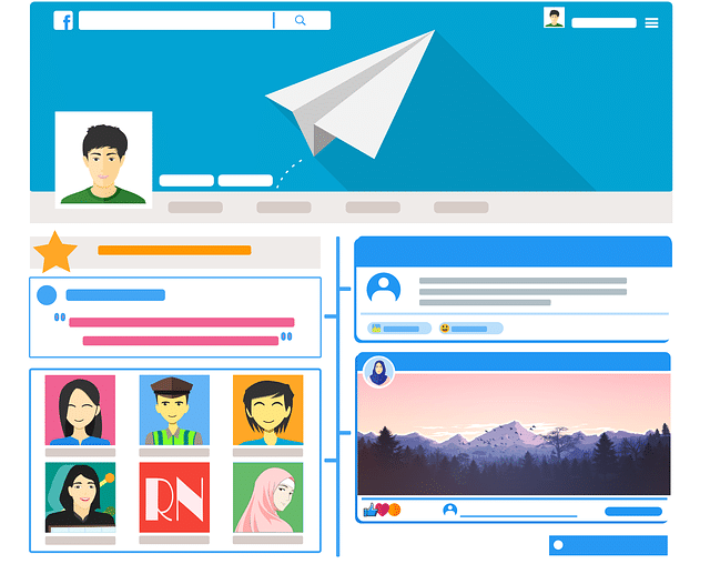
If there are particular dimensions you need (i.e FB cover post versus Instagram post versus Web banner), mention them clearly. If you need resized options for the same creative across platforms, point that out, too. If you have certain standardized requirements, such as inclusion of logo, contact information, Website URL, font sizes, colors, etc. – specify those, as well. This will serve as a handy checklist for the team.
7. Set Realistic Deadlines
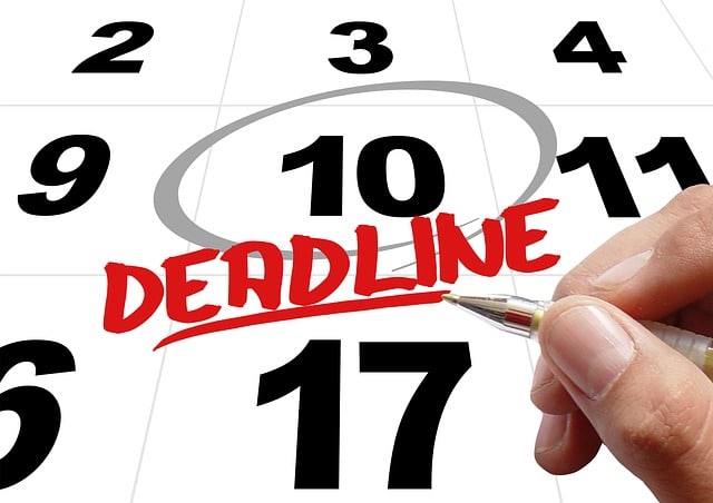
Not only should you mention the final deadline for the final version of artwork and/or copy, you should also create realistic checkpoints for at least two rounds of drafts / back-and-forth. In fact, we would highly recommend adding an additional day as a buffer in case something unexpected comes up.
And, there you go! You now have seven tried-and-tested tips to help you write a thorough creative brief that will serve as a roadmap for your design team and copywriters. Equipped with a proper creative brief, they will be able to put together amazing campaigns in a timely, efficient manner just the way you want.
Do you need help with an upcoming creative campaign? Don’t hesitate to contact our team of experts right here.
Sources –
> www.workamajig.com/blog/creative-brief
> www.newbreedmarketing.com/blog/7-key-elements-to-a-professional-creative-brief -
Jul 05 2019 How To Have A Smooth Working Relationship With Your Design Team
If visual content is 40x more likely to get shared on social media platforms, which is what research indicates, then the importance of a design team cannot be emphasized enough! And, yet, nearly every brand has their design team horror stories to tell. Here are 6 tips to help you maintain a smooth working relationship with your graphic designers, whether it be an agency or a freelancer.
1. Value Good Design
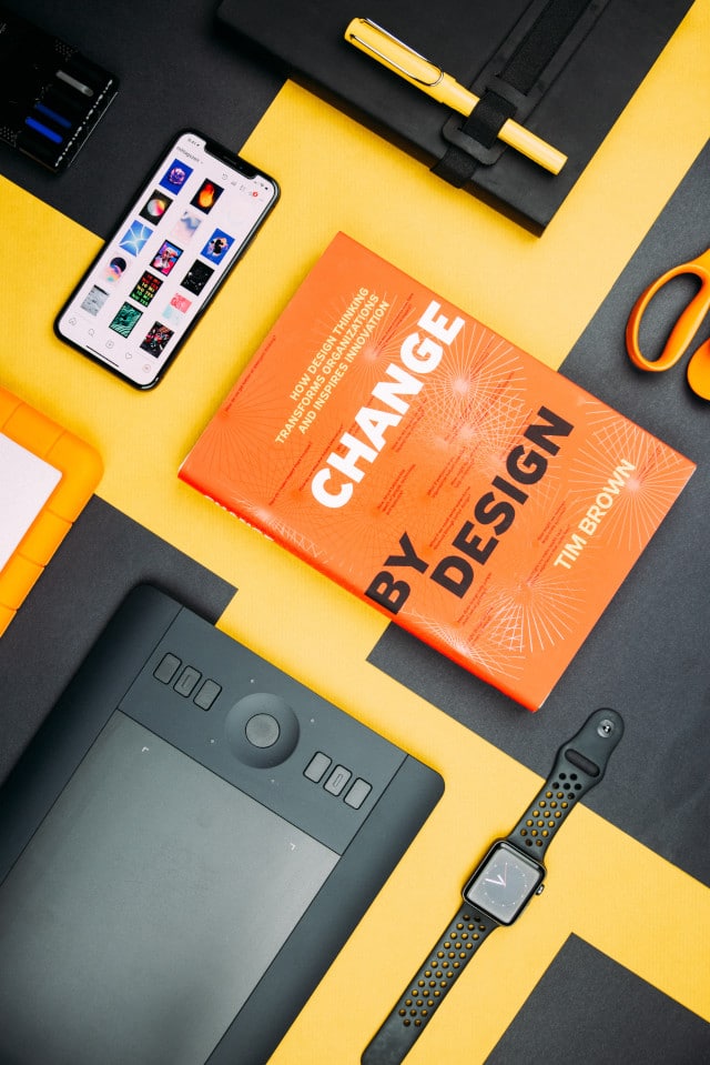
The first step for a healthy professional relationship with your design team is to understand the value it carries. This means you should incorporate design from the strategy stage itself, not as an after-thought. It also means knowing how to be reasonable, both in terms of remuneration offered, variations requested, revisions solicited and turnaround time expected. This also means you shouldn’t ask for source files to “edit” on your own, because that’s usually offensive to most designers (you probably don’t know have the software or know how to manipulate files anyhow!).
2. Consider A Bespoke Working System

If you require creatives in a set turnaround time at fixed intervals, you may want to consider putting your design team and/or freelance designer on a fixed hours work-from-home retainer, where they allocate a certain number of hours on certain days to be on standby for artwork and/or revisions needed. Many agencies complain that they don’t receive work “fast enough” from designers – this system eliminates this issue altogether.
3. Communicate Openly

Open communication is THE most essential ingredient in any successful relationship, including professional ones, especially if you’re hoping to build a long-term one with your designer (which you should!). Ask them for their inputs about design strategy based on THEIR experience and expertise. Offer then specific feedback, rather than being vague when you’re unhappy with something they turn in. Figure out a system for workflow that meets the needs of both parties. It’ll save you a lot of grief.
4. Add An In-Person Element

When you are working with design teams and/or freelancers who are based out of other cities, having a quarterly or bi-annual in-person working session where you fly everyone down – designers, copywriters, marketing team, managers, etc. – into one location to brainstorm new ideas, discuss design trends, social media trends, new tools and technology, latest stats surrounding what has/hasn’t worked for your brand, etc. In-person energy can move a lot of mountains and bring about super creative ideas that wouldn’t be possible when everyone is scattered and never interacts face-to-face.
5. Be VERY Thorough

One of the easiest ways to run into huge trouble with your design team is to not be specific and detailed with them from the beginning. Offer them the following at the start of the project to minimize disappointment and endless back-and-forth –
* Mood board of references you like
* Brand book that specifies font choices, font sizes, brand primary colors, secondary/accent colors allowed, aesthetics, layout
* Reference folder of logo(s) + evergreen material on-file
* Editorial calendar of which piece is going out when so you can mutually back-track and set deadlines for draft 1, draft 2, final version(s)
* Detailed creative brief, including guidelines of information that must always be included (i.e. logo, SM handles, Website URL, email / phone, etc.) and layouts/dimensions (i.e. an Instagram post has very different dimensions from a FB cover pic)Do not, we repeat, DO NOT send your designer/team elements in bits and pieces – make sure they are provided everything they need in one go. Act professionally so you can set the tone for what you also expect in return.
6. Ask Questions Before Signing On

Although this might seem basic, you’d be surprised how often people ignore the importance of asking the right questions at the hiring stage. Check references and work samples. And, observe if you have any working chemistry with one another – if you can’t stand your designer in the interview process, chances are you’re not going to find them very pleasant later on, either! Offering a paid trial project is also a great way to test the waters before signing on for a long-term association.
We hope these 6 tips help you establish a healthy relationship with your design team that yields amazing visual content! If you need any help, reach out to us right here.
Sources –
> https://medium.com/designing-atlassian/7-tips-to-create-high-functioning-design-teams-part-1-1e0c9ea44f0d
> https://blog.percolate.com/2015/05/finding-a-creative-agency/
> www.huffpost.com/entry/8-best-tips-for-worki_b_5473608
> www.canva.com/learn/10-things-never-say-graphic-designer-probably/ -
Jul 03 2019 How To Use FREE, High Quality Graphics
According to Social Media Today –
* People remember visual information 6x more effectively
* Tweets with images receive 150% more retweets
* Facebook posts with images draw 3.2x more engagement
* LinkedIn posts with images draw a 98% higher comment rate
* Video content, in general, generates 80% higher conversionAnd, according to HubSpot, visual content is 40 times more likely to get shared on social media compared to non-visual content!
As you’ve probably realized by now, if visual content is what’s dominating social media feeds, the importance of using only high quality graphics is paramount. But, not every brand can afford to invest in photographers and graphic designers consistently. That’s where the following tips will prove handy. Let’s take a look at how you can use FREE, high quality graphics in your digital marketing endeavours –
Step 1 – Create an Image Bank of Royalty Free Photos

Websites like Unsplash and Pixabay have a massive database of free, high-res images you can use across pretty much any topic. Once you have a social media editorial calendar in place, all you need to do is search for relevant keywords on these platforms, download the images that seem appealing and organize them in a folder you can easily access as and when needed. Not being able to afford fancy photo shoots is no longer an excuse to put up sloppy graphics!
Step 2 – Customize Creatives in a Consistent Format
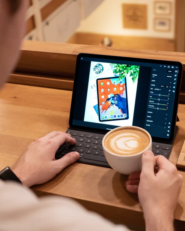
Once you’ve created an image bank by following Step 1 above, turn to one of our favorite resources – Canva! Canva has a ton of layouts to pick from in a variety of pre-set sizes for Facebook, Twitter, Instagram, Facebook Covers, Instagram Stories, etc. Since image dimensions are different for each platform, this feature is a lifesaver.
Furthermore, you don’t need any design or editing experience to modify your images on Canva – it is extremely user-friendly to use by even the most beginner-level person. However, rather than changing the look and feel of your creatives every other day, try to stick to particular colors, fonts, layouts so there is consistency and alignment with your overall branding.
If all fails, you can also consider using something as simple as Powerpoint to add text boxes on top of the photographs you’ve curated, as well as your brand’s logo. Or, you can use phone-based collage apps to add text and borders, as well. However, we would again like to emphasize that Canva is your best bet, given the level of sophistication it offers.
Step 3 – Don’t Underestimate the Power of Typography

Motivational quotes and testimonials always perform well on social media platforms, because they are positive in nature and humans are drawn toward uplifting, feel-good content. Tools like Canva, Gravit, Snappa, etc. all offer you the ability to create nice text-based creatives that use stunning font options. Harness these tools to the max, rather than using boring Times New Roman font on a plain white square (epic fail!).
Step 4 – Curate a Content Bank of GIFs

GIFs are on the rise – brands like Dell, Netflix, McDonalds, Nike and Paramount have all been using GIFs in their social media outreach and even in email campaigns! Why? Because GIFs are FUN – they brighten up one’s mood, and humor is contagious.
Step 5 – Build Simple Infographics

According to NN Group, infographics are shared and liked on social media platforms 3x more than other content categories. After all, infographics make it easier for audiences to follow different points/steps. A handy tool to bookmark is Infogram – you can easily create infographics, reports, charts and more to build your brand’s credibility.
Step 6 – Pick Consistent Overlays / Filters

If you are clicking photographs yourself, make sure you use consistent overlays/filters so branding is consistent. Instagram has pre-set filters you can pick one from to stick to.
Social Media Examiner reports 37% of marketers think visual marketing is the most content bucket. Yet, Venngage reveals 29% of marketers really struggle to produce well-designed visual content. We hope the six steps above help you overcome these challenges so you can stay ahead of your competition with kickass visual material! If you need any help with content generation for social media, don’t hesitate to reach out to us right here.
Sources –
> https://buffer.com/library/free-images
> https://zapier.com/blog/graphic-design-tools-for-social-media-images/
> https://blog.hootsuite.com/resources-to-create-quick-and-beautiful-images-for-social-media/
> www.socialmediatoday.com/news/7-tips-for-using-visual-content-marketing/548660/
> www.digitaldoughnut.com/articles/2017/january/gif-the-biggest-digital-marketing-trend-for-2017
> www.lucidpress.com/blog/32-infographic-stats-facts


